import numpy as np
import pandas as pd
import matplotlib.pyplot as pltData Visualization – ggplot2 📊
MATH/COSC 3570 Introduction to Data Science





ggthemes, ggridges, ggbeeswarm, ggdendro, ggpubr, ggmap, ggradar, ggcorrplot, GGally, and more!
Visualizing Data
- After importing or reading data into R, the first thing we need to do is to understand our data.
- What are variables in the data set?
- Are the variables related in some way?
- Are there any missing values, outliers, or other weird values?
- Do we need to transform some variables to make it easier to answer our research questions or to do our analysis.
- So before doing data analysis, we should understand our data well, and be able to answer all those questions. This understanding helps us choose the correct model and algorithm and helps us do the correct analysis.
- this week and and next week, we will be talking about data visualization.
- So it is great to master this package because with the package you can produce lots of beautiful and amazing plots. All right. Let’s dive in and see how to create a ggplot!
Plotting Systems: base, lattice and ggplot2


ggplot2
has the most powerful functionality.
is more beautiful?
has larger file size that occupies more memory space and has longer render time.
- We already learned a little bit about R plotting, right? In fact R has three main plotting systems, the base package, lattice package, and the ggplot2 package.
- There are lots of tools and packages that greatly extend the ggplot2 functionality, as I listed here.
- Basically, ggplot2 has the most powerful functionality than the other two. It can create lots of graphs that the other two cannot, and ggplot2 is more beautiful than the other two, I think. But one disadvantage of ggplot2 is that it’s size is larger than the other two, occupying more memory spaces than the other two, and the rendering time is longer.
Elegant Data Visualisation
Using the Grammar of Graphics
The ggplot2 Grammar
- Three main components:
| Grammar element | What it is |
|---|---|
| Data | The data frame used for plotting |
| Geometry |
|
| Aesthetic mapping |
|
- How we define the mapping depends on what geometry we are using.
. . .
ggplot(data = ___________, mapping = aes(____________)) +
       geometry_function(_________) +
other options/layers- Data: the data input of ggplot2 is always a data frame, not a vector, or matrix.
- Geometry: defines what kind of plot we are going to make.
- Aesthetic mapping: basically tell ggplot2 how we decorate the plot and make it more visible or more informative. For example, use different point colors or sizes for different categories, such male and female
- Structure of the code for ggplots can be summarized as the following code.
ggplot(data = <DATASET>, mapping = aes(<MAPPINGS>)) +
       <GEOM_FUNCTION>() +
       other options/layers
mpg Data
ggplot2::mpg# A tibble: 234 × 11
manufacturer model displ year cyl trans drv cty hwy fl class
<chr> <chr> <dbl> <int> <int> <chr> <chr> <int> <int> <chr> <chr>
1 audi a4 1.8 1999 4 auto(… f 18 29 p comp…
2 audi a4 1.8 1999 4 manua… f 21 29 p comp…
3 audi a4 2 2008 4 manua… f 20 31 p comp…
4 audi a4 2 2008 4 auto(… f 21 30 p comp…
5 audi a4 2.8 1999 6 auto(… f 16 26 p comp…
6 audi a4 2.8 1999 6 manua… f 18 26 p comp…
7 audi a4 3.1 2008 6 auto(… f 18 27 p comp…
8 audi a4 quattro 1.8 1999 4 manua… 4 18 26 p comp…
# ℹ 226 more rows- Here shows the mpg data set saved in ggplot2.
- It is a tibble with 11 variables, including ……
- We are gonna use it as an example to learn to create a ggplot.
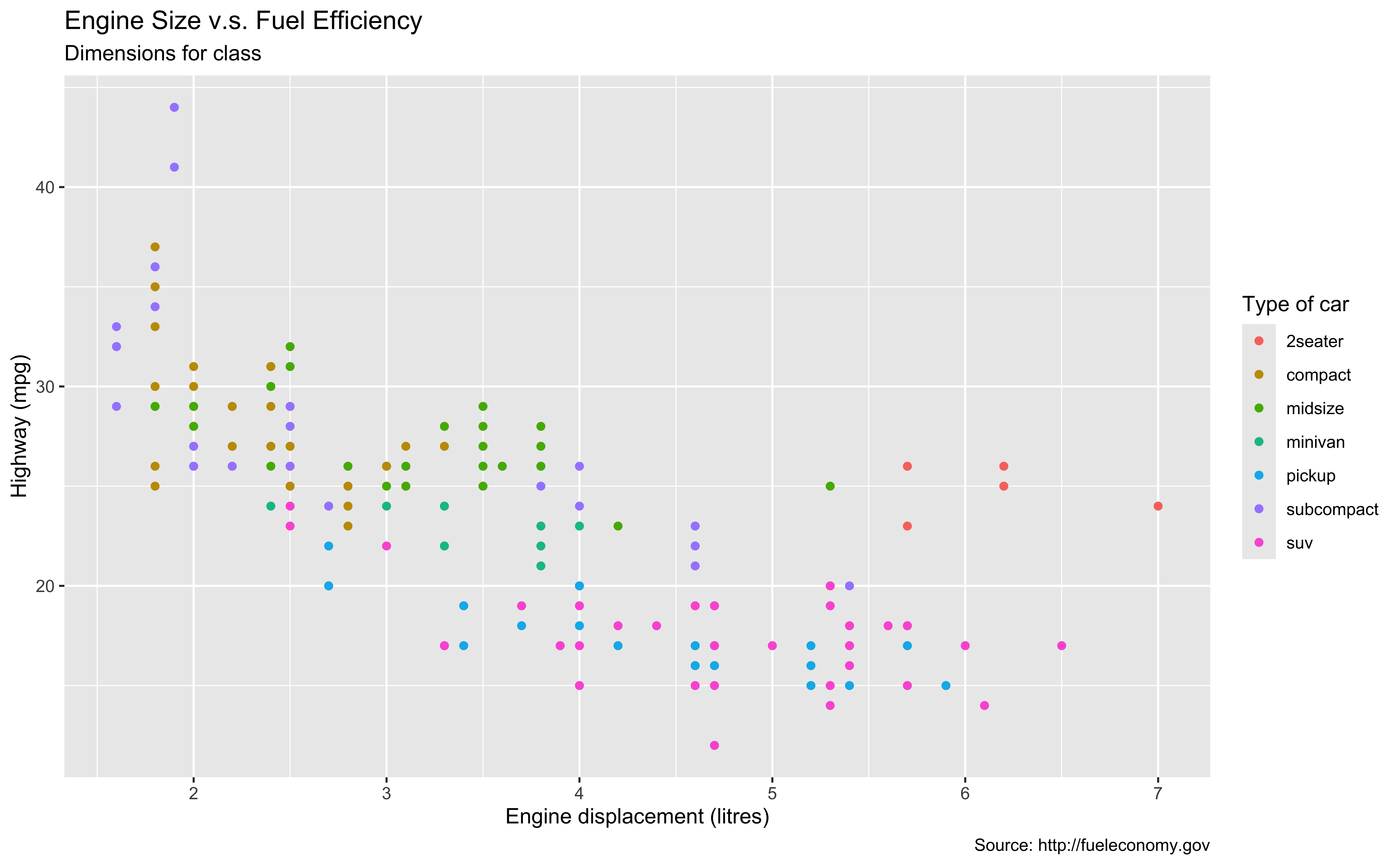
ggplot(data = mpg,
       mapping = aes(x = displ,
                     y = hwy,
                     color = class)) +
    geom_point() +
    labs(title = "Engine Size v.s. Fuel Efficiency",
         subtitle = "Dimensions for class",
         x = "Engine displacement (litres)", y = "Highway (mpg)",
         color = "Type of car",
caption = "Source: http://fueleconomy.gov")- Here shows a ggplot, showing the relationship between mpg and engine displacement. We have titles, labels, and footnote.
- And we also use different colors to show different types of car. Right.
- The code is right here. We are gonna create this plot step by step by step OK.
Coding out loud 😃
Start with the
mpgdata frame

- Remember the data input is always a data frame.
- When you call the function ggplot(), but without any geometry, R just renders a plot background colored in gray.
Start with the
mpgdata frame, map engine displacement to the x-axis
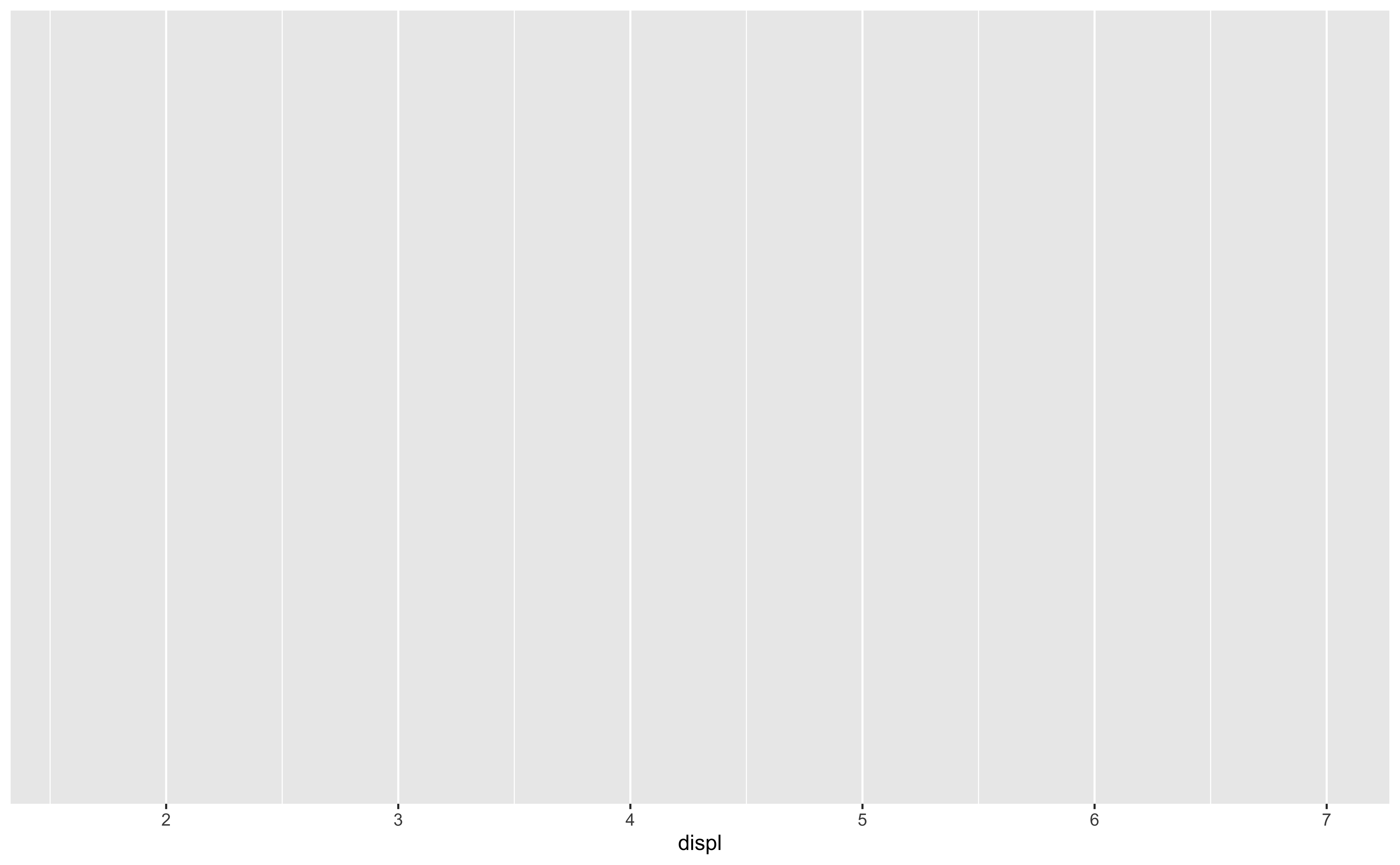
- R will create tick marks and label of x-axis for you.
- Then after specifying the data set, we can start decorating our plot.
- Remember we are going to create a scatter plot of displacement and miles pewr gallon.
- So we can first map engine displacement to the x-axis using mapping = aes(x = displ)
- displ is the variable name in the mpg data set.
- R will create some default tick marks and label of x-axis for you.
Start with the
mpgdata frame, map engine displacement to the x-axis and map highway miles per gallon to the y-axis.
- Specify
y = hwyin the sameaes()of themappingargument asx = displ, separated by comma.
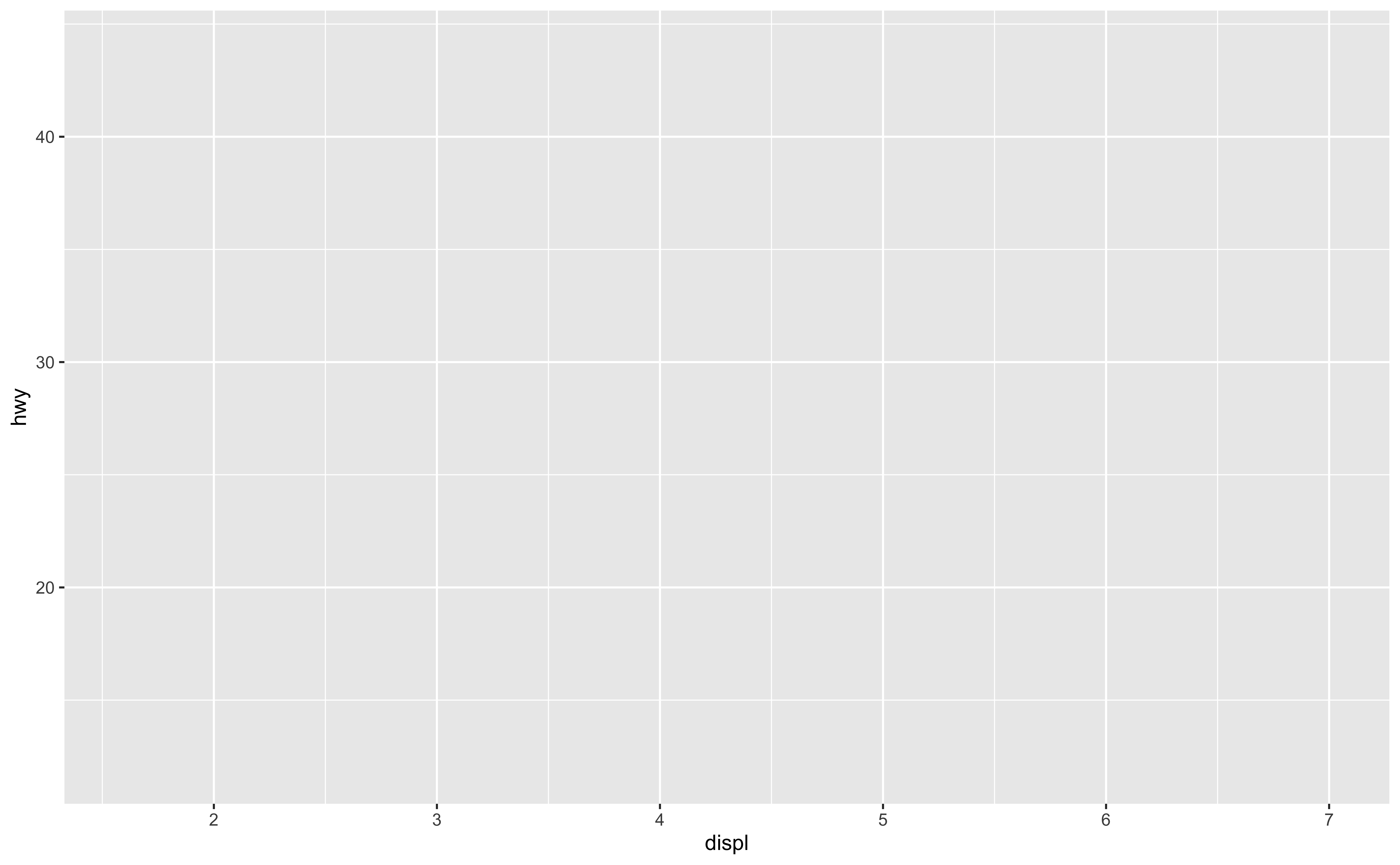
- Then we map highway miles per gallon to the y-axis by specifying
y = hwyin aesthetics -
hwyis the variable name in the mpg data set. - R will create some default tick marks and label of y-axis for you.
- Now we have variables in both x and y axis. It’s time to define the geometry of the plot. That is, tell ggplot, what kind of plot you want!
Start with the
mpgdata frame, map engine displacement to the x-axis and map highway miles per gallon to the y-axis. Represent each observation with a point
ggplot(data = mpg,
       mapping = aes(x = displ,
                     y = hwy)) +
geom_point() #<<- To define a geometry, add a geom layer.
Don’t miss + sign!
For scatterplots we add points, and use
geom_point()
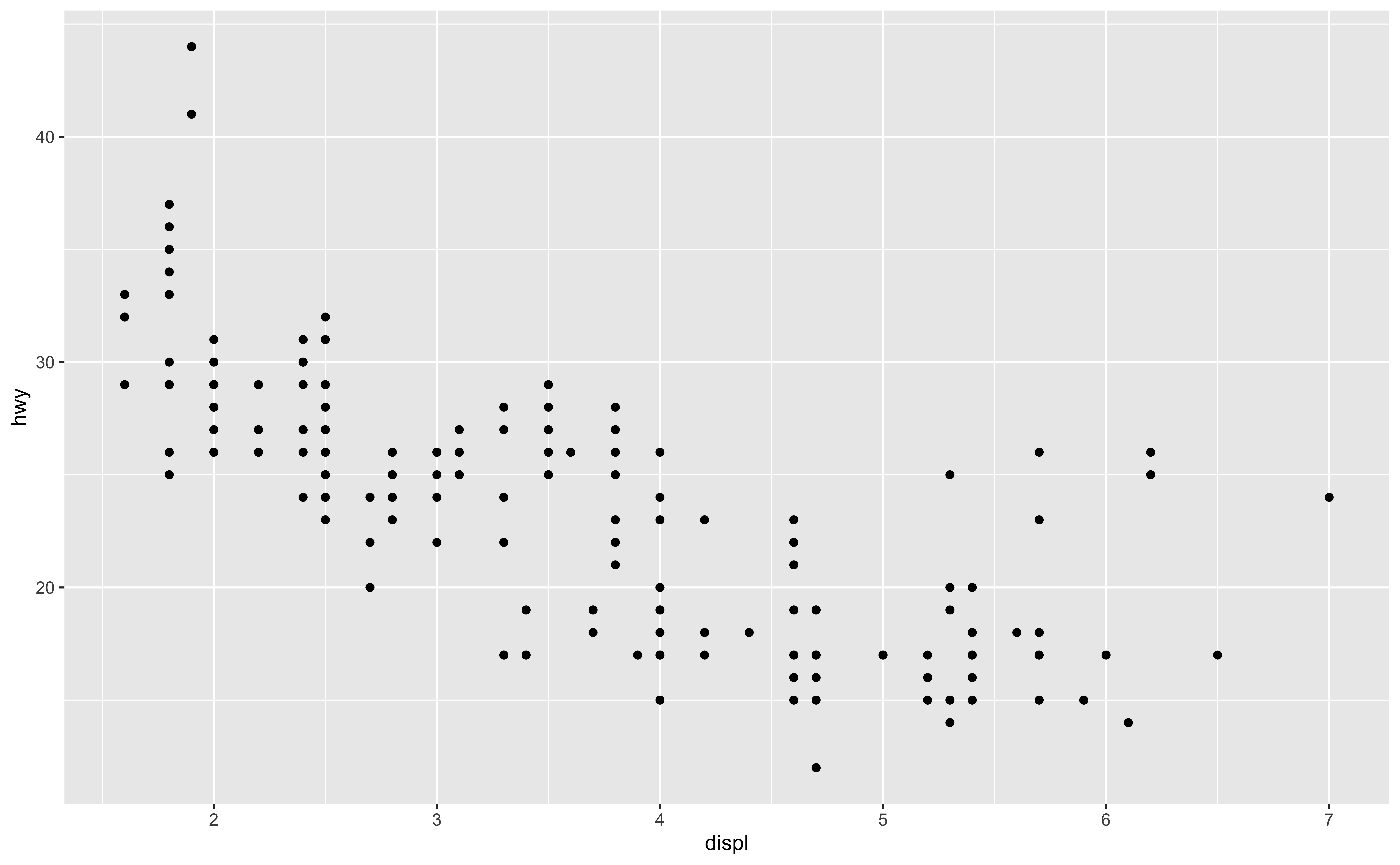
geom (geometric object) - What’s the next? Remember we use different colors of points to represent different car types, right? - Which part of code you think we can use to color the points? - aesthetics in the mapping! - By default, ggplot generates black solid points, each representing an observation’s hwy and displ value.
Start with the
mpgdata frame, map engine displacement to the x-axis and map highway miles per gallon to the y-axis. Represent each observation with a point and map type of car (class) to the color of each point.
ggplot(data = mpg,
       mapping =
         aes(x = displ,
             y = hwy,
             color = class)) + #<<
  geom_point()
Add
color = classinaes()of themappingargument, whereclassis the variable name for type of car.ggplot automatically generates a legend on the right.
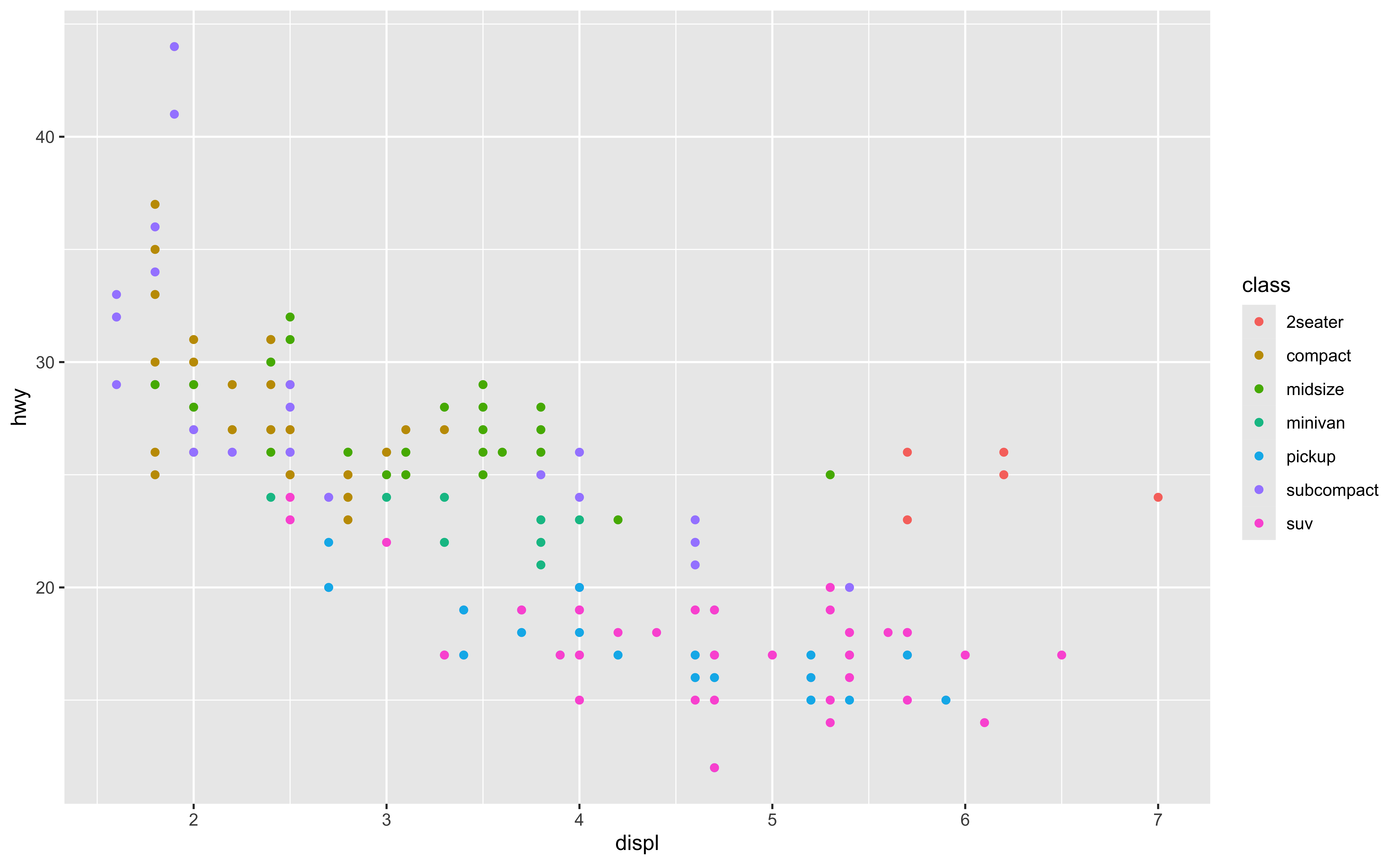
- To map type of car (class) to the color of each point, add
color = classinaes()of themappingargument - And now you can see that each color represent a type of car.
- ggplot automatically generates a default legend on the right, where the title of the legend is the variable name, and the names of legend are the variable values.
- OK. We are almost done. The rest are just adding titles x, y labels. Let’s see how.
Start with the
mpgdata frame, map engine displacement to the x-axis and map highway miles per gallon to the y-axis. Represent each observation with a point and map type of car (class) to the color of each point. Title the plot “Engine Size v.s. Fuel Efficiency”
ggplot(data = mpg,
       mapping = aes(x = displ,
                     y = hwy,
                     color = class)) +
  geom_point() +
  labs(
    title="Engine Size vs. Fuel Efficiency" #<<
)- Add any labels in
labs()layer.
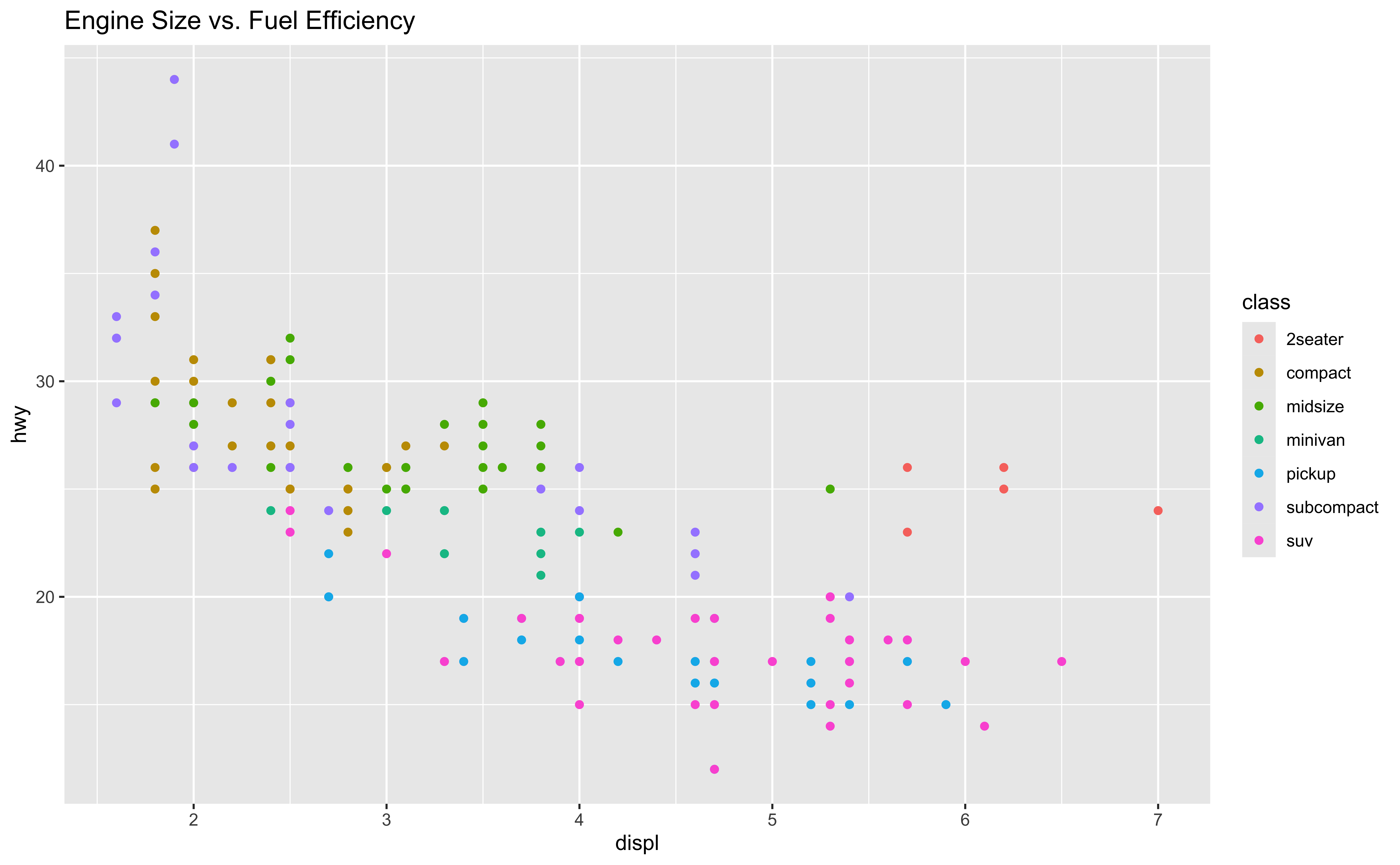
- We can add any labels in
labs()layer. - Here we set title = “Engine Size v.s. Fuel Efficiency”
Start with the
mpgdata frame, map engine displacement to the x-axis and map highway miles per gallon to the y-axis. Represent each observation with a point and map type of car (class) to the color of each point. Title the plot “Engine Size vs. Fuel Efficiency”, add the subtitle “Dimensions for class”
ggplot(data = mpg,
       mapping = aes(x = displ,
                     y = hwy,
                     color = class)) +
  geom_point() +
  labs(
    title = "Engine Size vs. Fuel Efficiency",
    subtitle = "Dimensions for class" #<<
) - Add a subtitle in
labs()
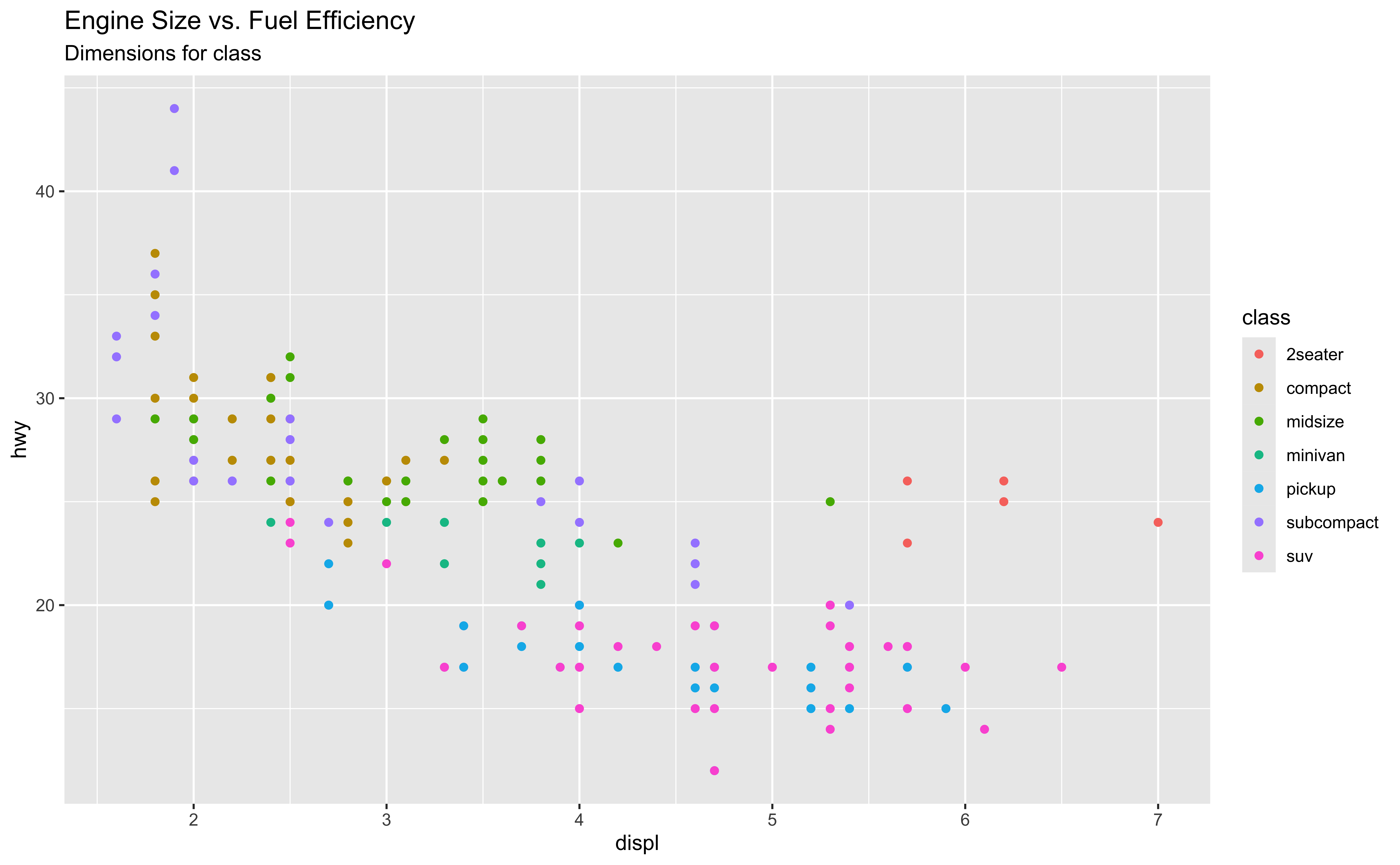
- We can also add a subtitle title “Dimensions for class”.
- BTW, we can change the font size, color and position of the title. Here is just the default setting.
- In theme(plot.title = element_text(size = 20, color = “#1b98e0”)
- https://statisticsglobe.com/ggplot2-title-subtitle-with-different-size-and-color-in-r
- https://en.wikipedia.org/wiki/Point_(typography)
- https://stackoverflow.com/questions/17311917/ggplot2-the-unit-of-size
- We will talk about that if time permitted. Or I can ask you in homework and you can learn by yourself.
Start with the
mpgdata frame, map engine displacement to the x-axis and map highway miles per gallon to the y-axis. Represent each observation with a point and map type of car (class) to the color of each point. Title the plot “Engine Size vs. Fuel Efficiency”, add the subtitle “Dimensions for class”, label the x and y axes as “Engine displacement (litres)” and “Highway (mpg)”, respectively
ggplot(data = mpg,
       mapping = aes(x = displ,
                     y = hwy,
                     color = class)) +
  geom_point() +
  labs(
    title = "Engine Size vs. Fuel Efficiency",
    subtitle = "Dimensions for class",
    x = "Engine displacement (litres)", #<<
    y = "Highway (mpg)" #<<
) 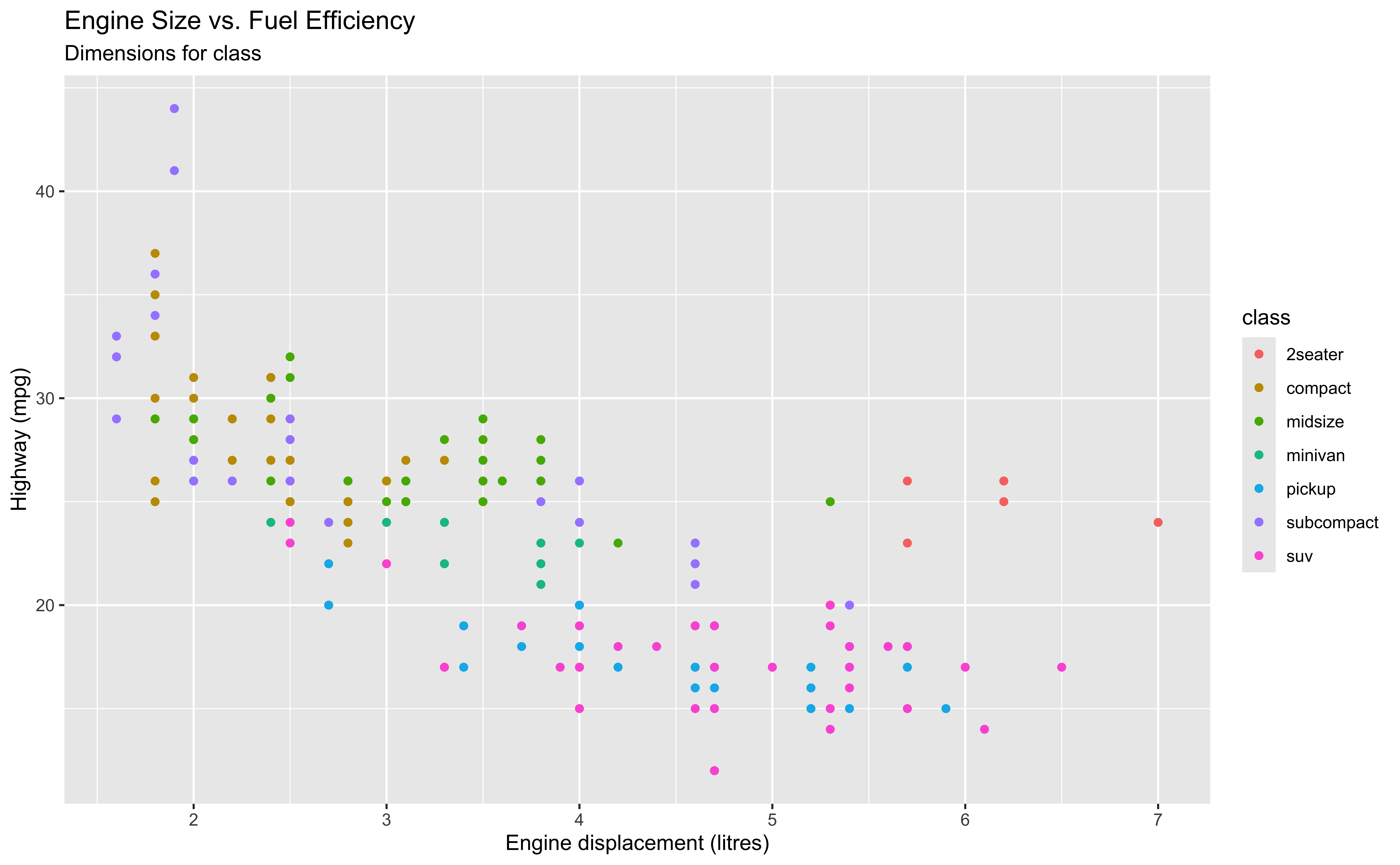
- We then label the x and y axes as “Engine displacement (litres)” and “Highway (mpg)”, respectively.
Start with the
mpgdata frame, map engine displacement to the x-axis and map highway miles per gallon to the y-axis. Represent each observation with a point and map type of car (class) to the color of each point. Title the plot “Engine Size vs. Fuel Efficiency”, add the subtitle “Dimensions for class”, label the x and y axes as “Engine displacement (litres)” and “Highway (mpg)”, respectively, label the legend “Type of car”
ggplot(data = mpg,
       mapping = aes(x = displ,
                     y = hwy,
                     color = class)) +
  geom_point() +
  labs(
    title = "Engine Size vs. Fuel Efficiency",
    subtitle = "Dimensions for class",
    x = "Engine displacement (litres)",
    y = "Highway (mpg)",
    color = "Type of car" #<<
) - The legend is generated when we map type of car (
class) to color.
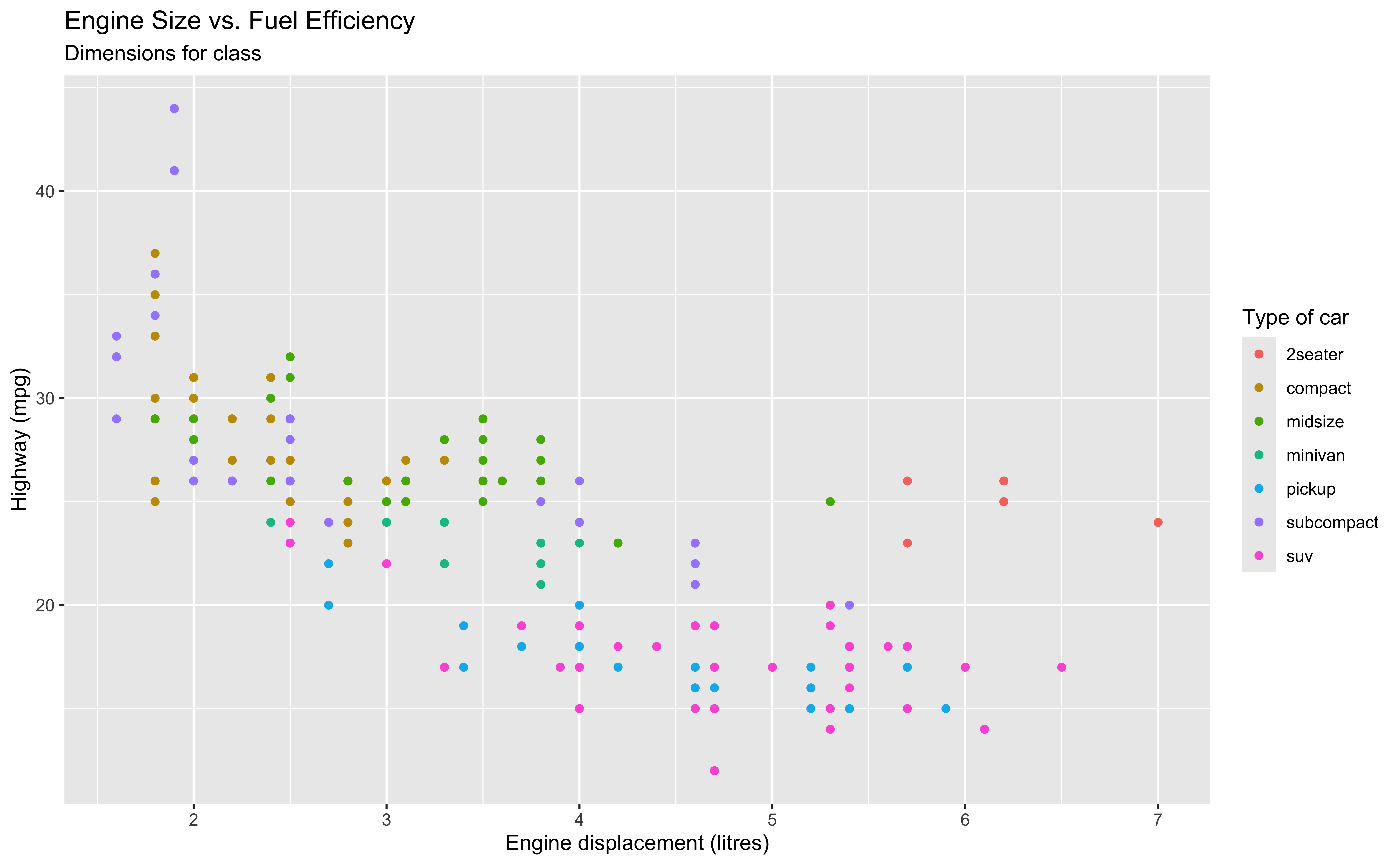
- We label the legend “Type of car” using color = “Type of car”. Why?
- Because the legend is generated when we map type of car to color.
- The color title is the legend title.
Start with the
mpgdata frame, map engine displacement to the x-axis and map highway miles per gallon to the y-axis. Represent each observation with a point and map type of car (class) to the color of each point. Title the plot “Engine Size vs. Fuel Efficiency”, add the subtitle “Dimensions for class”, label the x and y axes as “Engine displacement (litres)” and “Highway (mpg)”, respectively, label the legend “Type of car”, and add a caption for the data source.
ggplot(data = mpg,
       mapping = aes(x = displ,
                     y = hwy,
                     color = class)) +
  geom_point() +
  labs(
    title = "Engine Size vs. Fuel Efficiency",
    subtitle = "Dimensions for class",
    x = "Engine displacement (litres)",
    y = "Highway (mpg)",
    color = "Type of car",
    caption = "Source: http://fueleconomy.gov" #<<
) 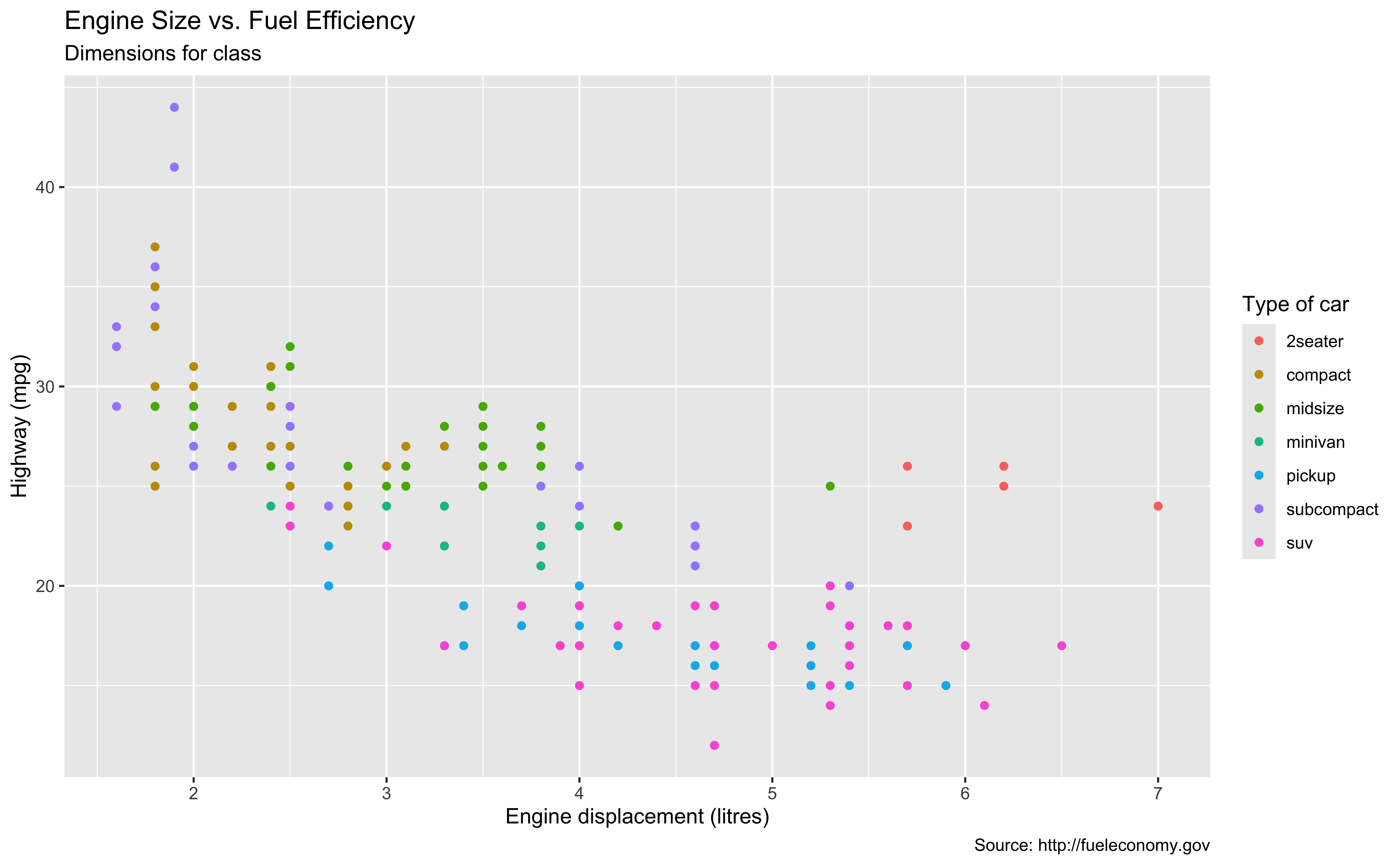
- Finally, we can add a caption for the data source using caption argument
- Then we are done! We have this beautiful scatter plot!
Start with the
mpgdata frame, map engine displacement to the x-axis and map highway miles per gallon to the y-axis. Represent each observation with a point and map type of car (class) to the color of each point. Title the plot “Engine Size vs. Fuel Efficiency”, add the subtitle “Dimensions for class”, label the x and y axes as “Engine displacement (litres)” and “Highway (mpg)”, respectively, label the legend “Type of car”, and add a caption for the data source. Finally, use a discrete color scale that is designed to be perceived by viewers with common forms of color blindness.
ggplot(data = mpg,
       mapping = aes(x = displ,
                     y = hwy,
                     color = class)) +
  geom_point() +
  labs(
    title = "Engine Size vs. Fuel Efficiency",
    subtitle = "Dimensions for class",
    x = "Engine displacement (litres)",
    y = "Highway (mpg)",
    color = "Type of car",
    caption = "Source: http://fueleconomy.gov"
    ) +
  scale_colour_viridis_d() #<<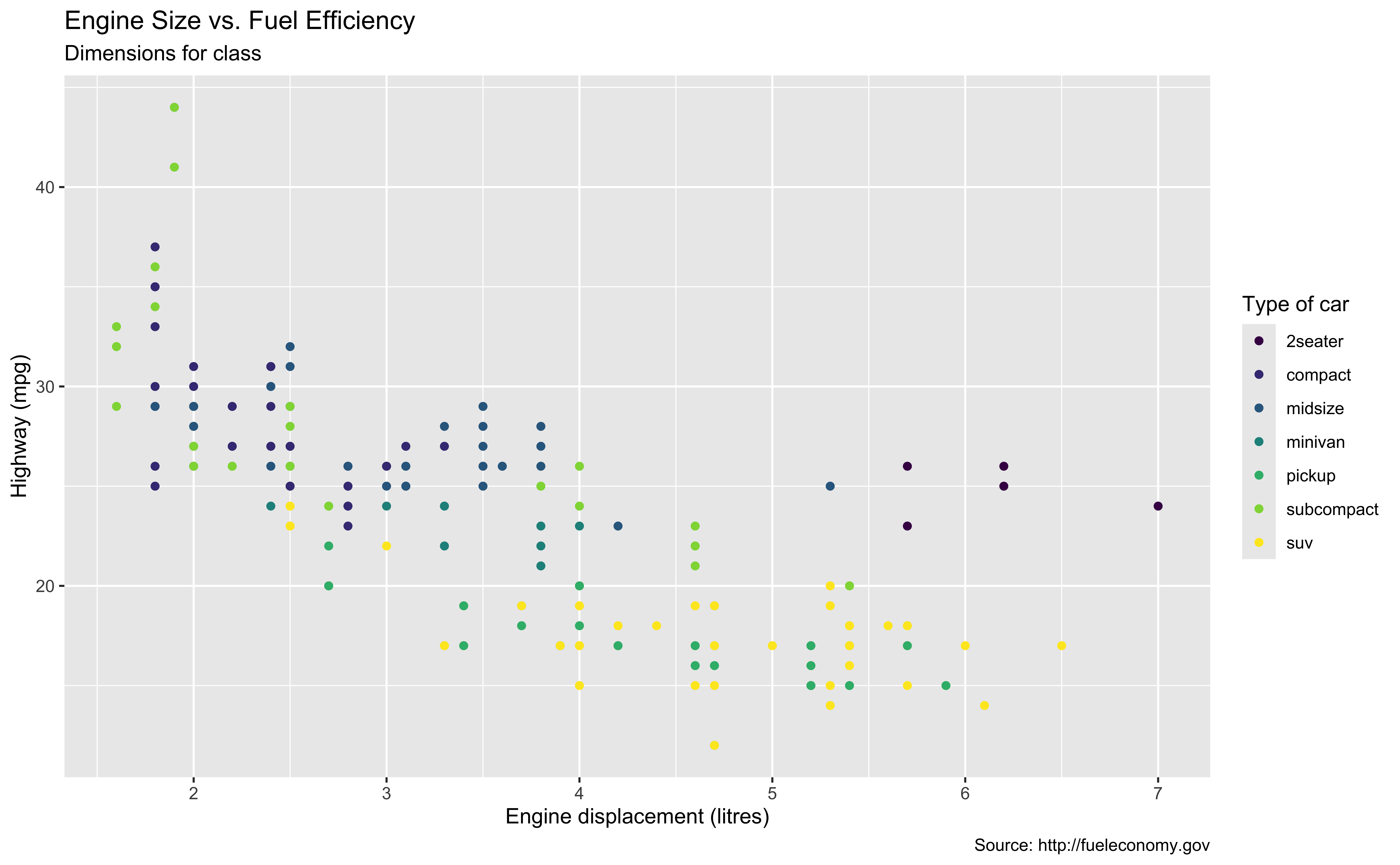
- And if we are considerate enough, we can use a discrete color scale that is designed to be perceived by viewers with common forms of color blindness.
- =======================================
- Let’s continue our discussion of ggplot2. We learned there are three main components of ggplot2, the data, which is a data frame, the geometry object, and aesthetics mapping.
- And we are free to add more layers with the plus sign to manipulate or put more features on the plot.
- In fact, we can actually save a ggplot as an object, and we can recreate the plot by just printing the object out. Let’s see how.
11-ggplot2
In lab.qmd ## Lab 11 section,
Use
readr::read_csv()to import the data penguins.csv into your R workspace.Generate the following ggplot:
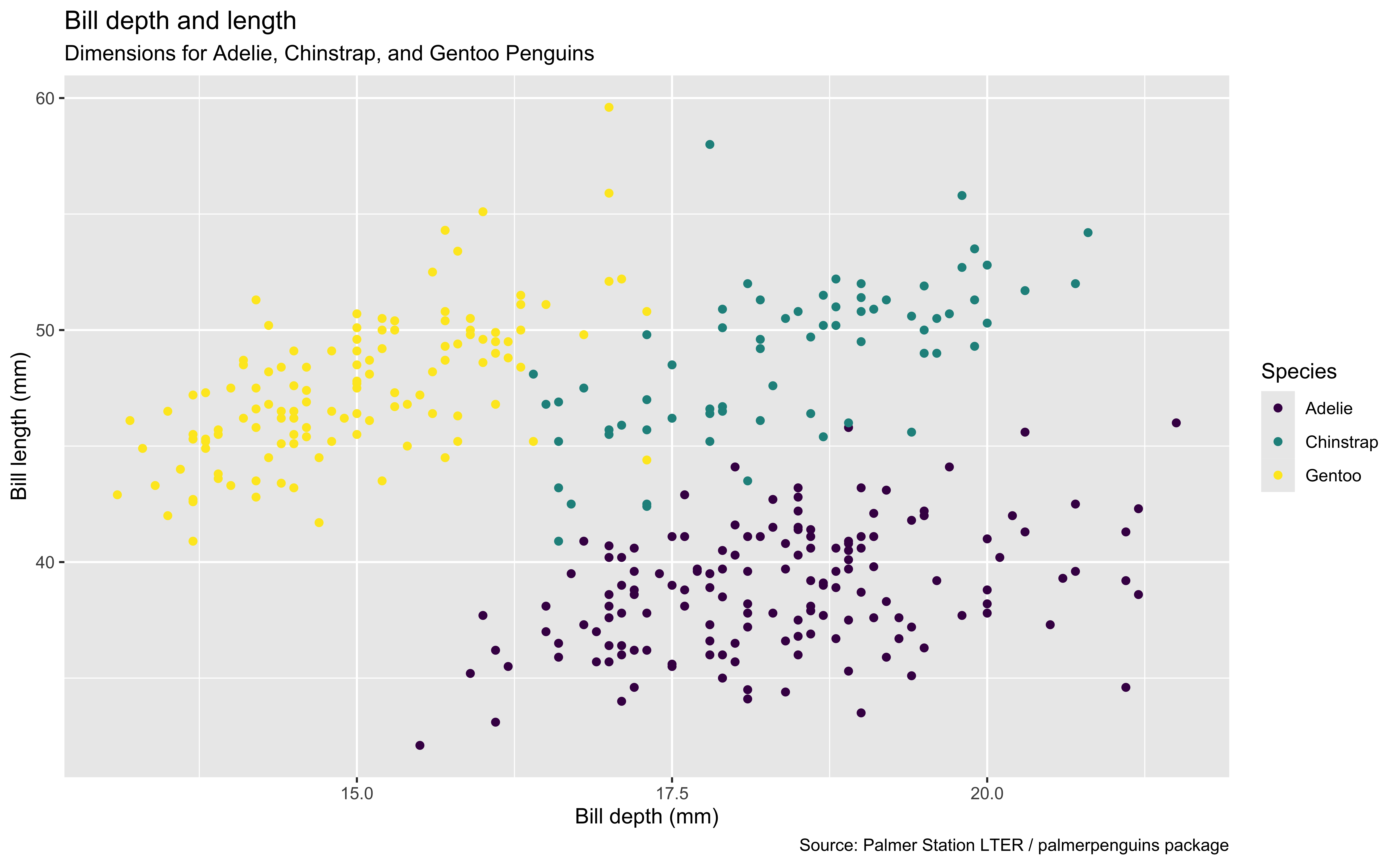
penguins <- read_csv(_________________)
________ |>
  ggplot(mapping = ____(x = ______________,
                        y = ______________,
                        colour = ________)) +
  geom______() +
  ____(title = ____________________,
       _________ = "Dimensions for Adelie, Chinstrap, and Gentoo Penguins",
       x = _____________, y = _______________,
       _______ = "Species",
       _______ = "Source: Palmer Station LTER / palmerpenguins package")
Assign a Plot to an Object
p <- ggplot(data = mpg,
            mapping =
                aes(x = displ,
                    y = hwy,
                    color = class)) +
    geom_point()
p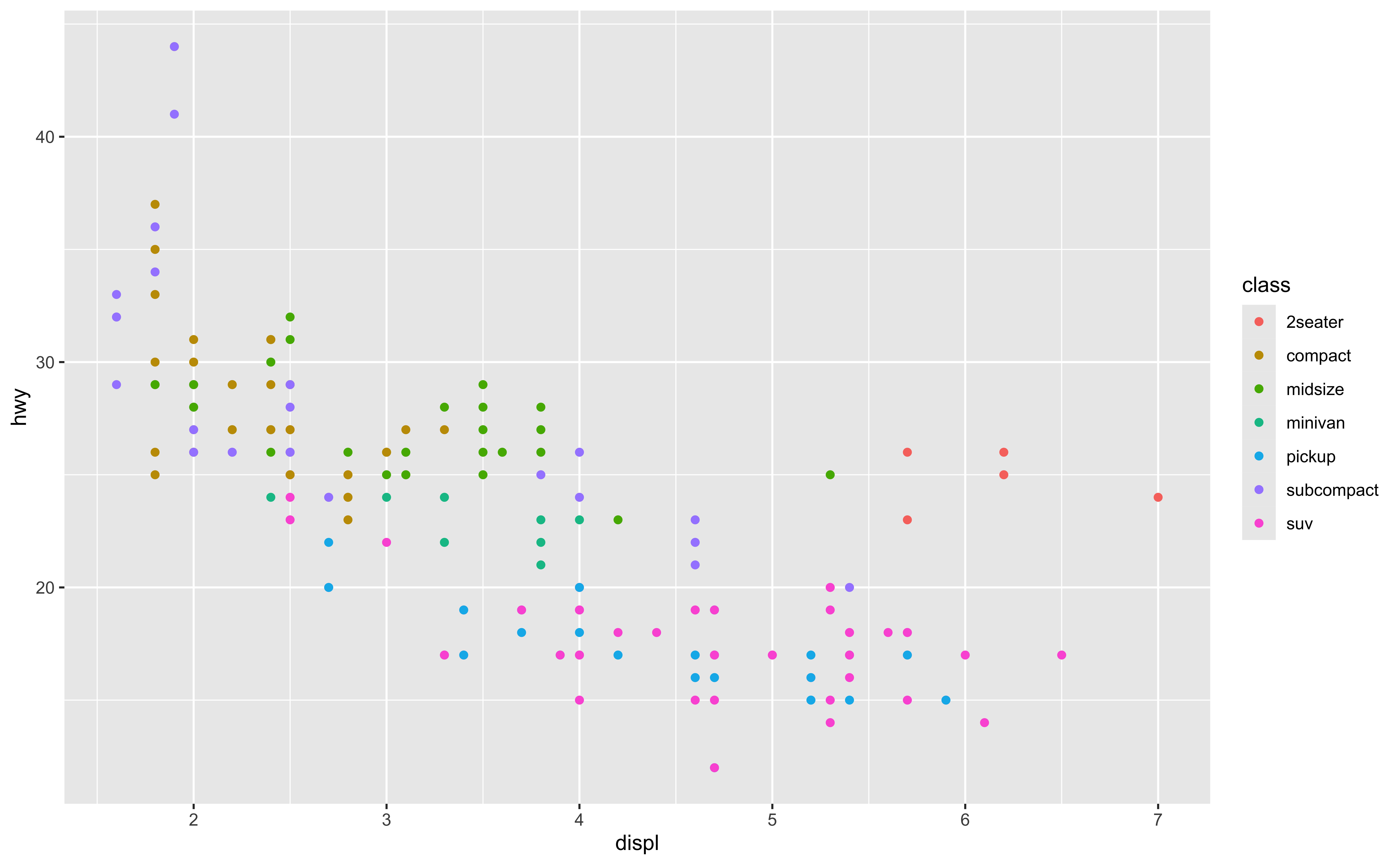
p + labs(
      title = "Engine Size vs. Fuel Efficiency",
      subtitle = "Dimensions for class",
      x = "Engine displacement (litres)",
      y = "Highway (mpg)",
      color = "Type of car",
      caption = "Source: http://fueleconomy.gov"
    )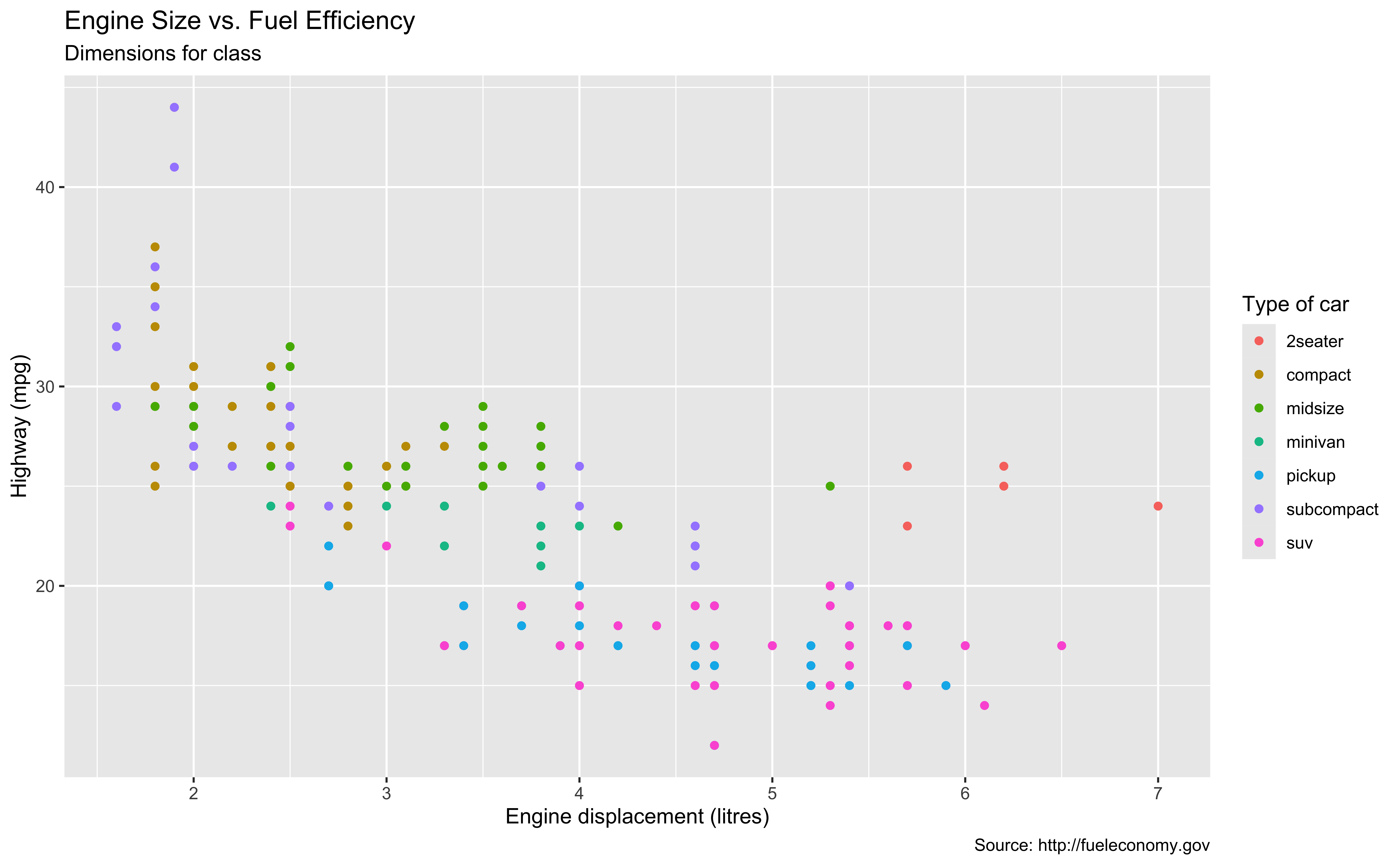
- So one advantage of ggplot is that you can Assign a ggplot to an Object that has its own class ggplot.
- base R plotting system is not able to assign an object to a plot for rendering.
- here, I assign the plot to the object called “p”. When I print it out, it shows the ggplot.
- This object “p” stores the scatter plot structure, and can be saved for later use.
- For example, we can add labels on the existent ggplot object. And if we want to use the same scatter plot but with a different labels or any other features, just add the new labels or features to the object “p”.
- So this way we don’t need to type the basic ggplot structure all over again.
- It’s quite useful if you wanna generate the same plot but with different decorations. Maybe here you want red labels, and at another place you want blue labels, for example.
Theme Options
Options include
theme_grey() (default), theme_bw(), theme_dark(), theme_classic(), etc.
p + theme_bw()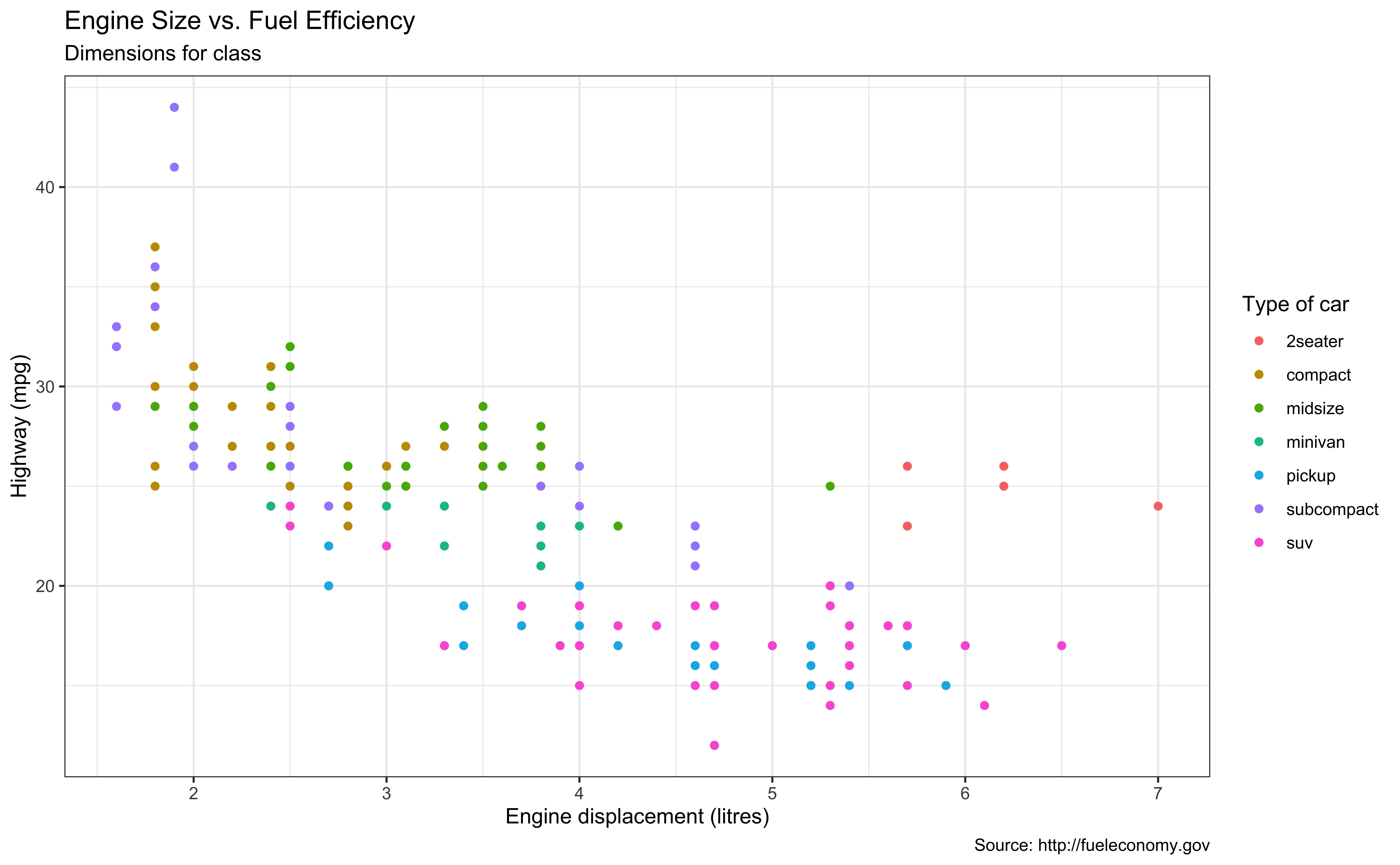
p + theme_dark()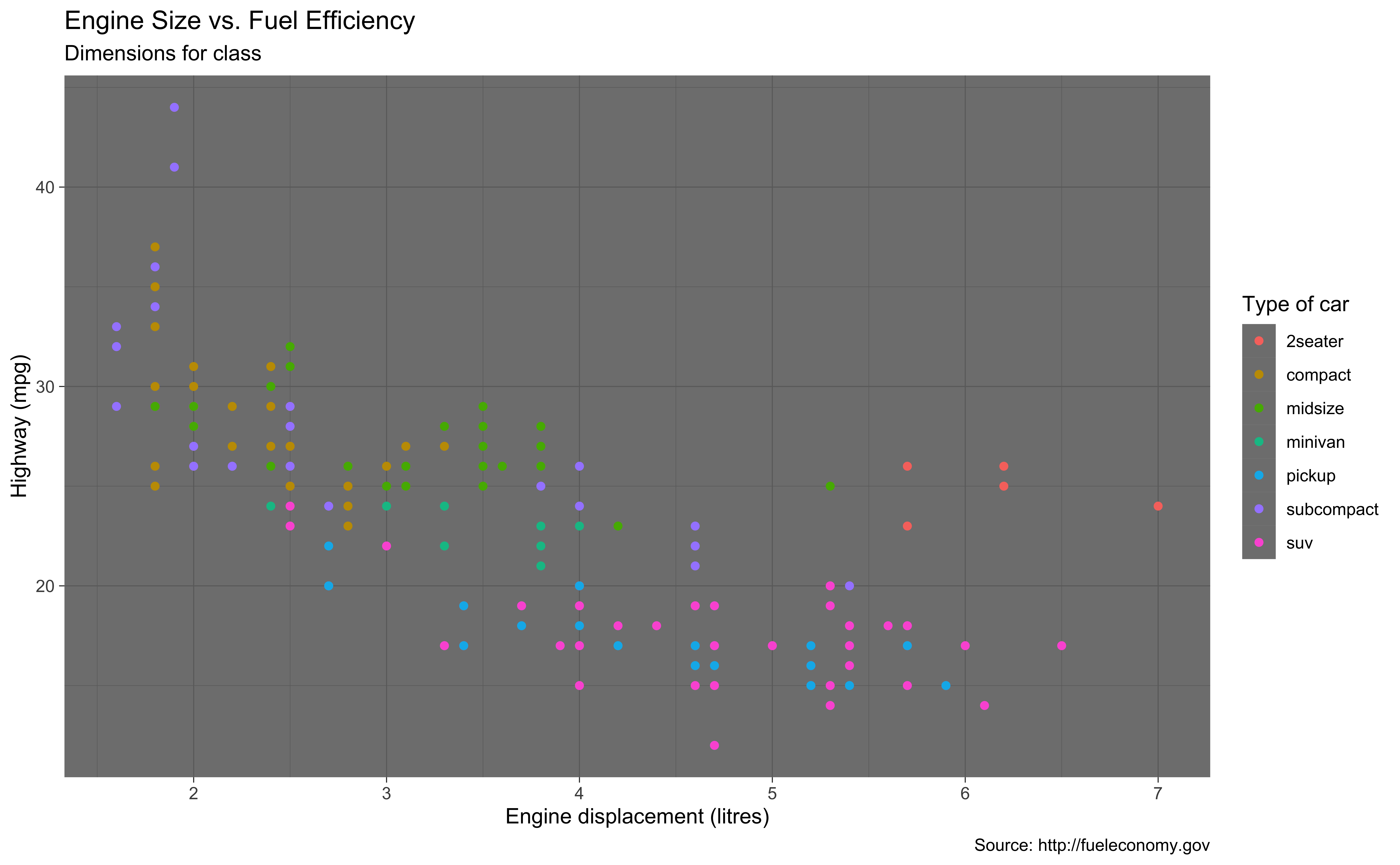
- OK theme. You can add a theme layer theme() to your plot to tweak the display of the theme the plot is currently using, including title, axis labels, etc. Check theme() in the help page. You will learn which components of a plot can be changed.
- Some theme options you can use include
theme_grey()(default),theme_bw(),theme_dark(),theme_classic(), etc - To use another theme, we just add its corresponding theme function to the plot.
- Here shows how the black/white theme and dark theme look like.
Add-on 📦: ggthemes
Many other themes are added by the package ggthemes.
Check package website, ggplot2 extensions, and ALL YOUR FIGURE ARE BELONG TO US for more themes.
p + ggthemes::theme_economist()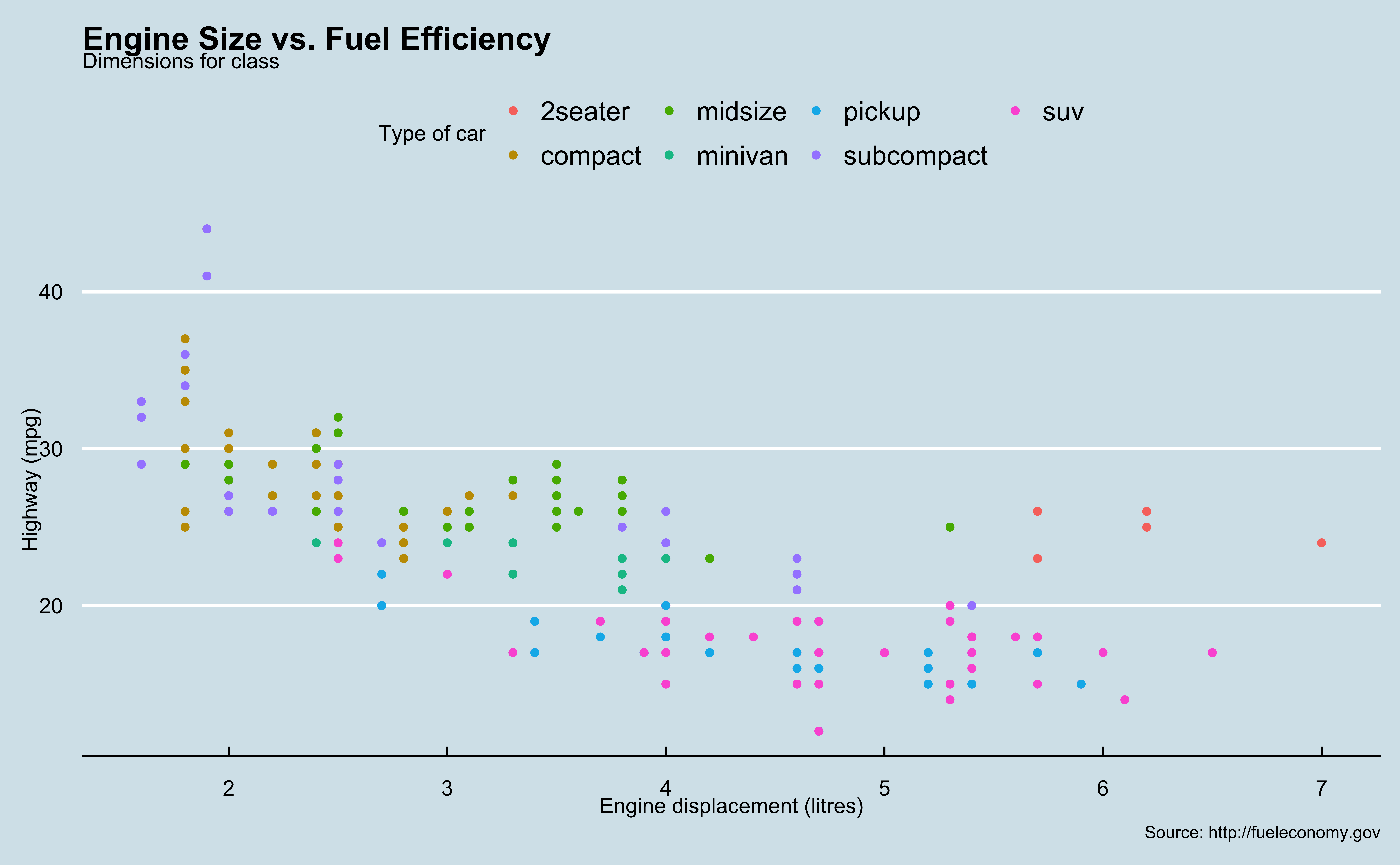
p + ggthemes::theme_wsj()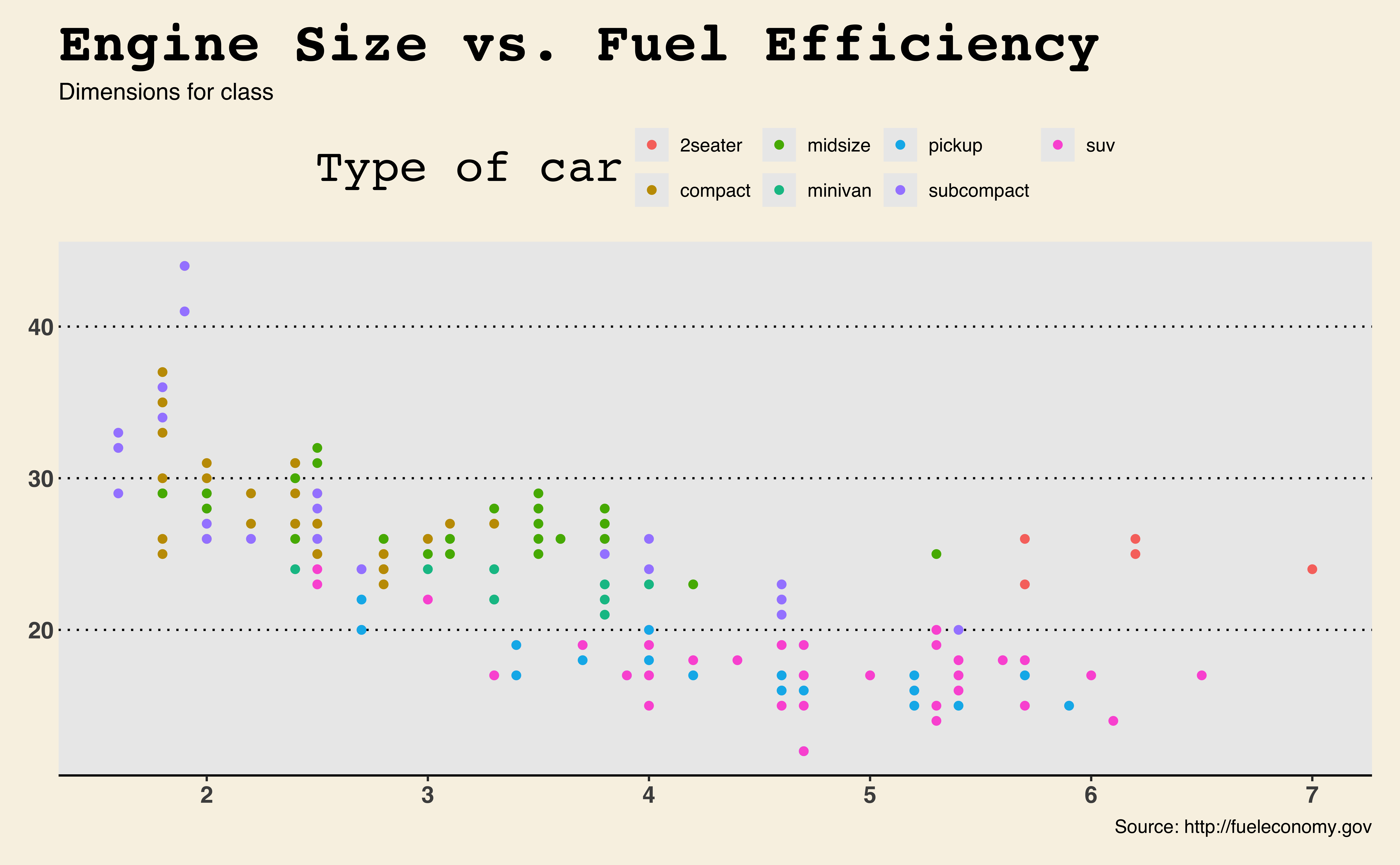
- As I mentioned before, many people are really into ggplot2, and lots of add-on packages have been created for ggplot2, that greatly extend its functionalities.
- For example, there is a package called ggthemes that provide more theme options for us.
- Here I showed you the same scatter plot but in economist and fivethirtyeight theme.
Customize Theme
- Use
theme()to tweak the display of the current theme, including title, axis labels, etc. Check?theme.
p + theme(
    panel.background =
        element_rect(fill = "#FFCC00",
                     colour = "blue",
                     linewidth = 2.5,
                     linetype = "solid"),
    plot.background =
        element_rect(fill = "lightblue"),
    axis.line =
        element_line(linewidth = 0.5,
                     linetype = "solid",
                     colour = "red")
    )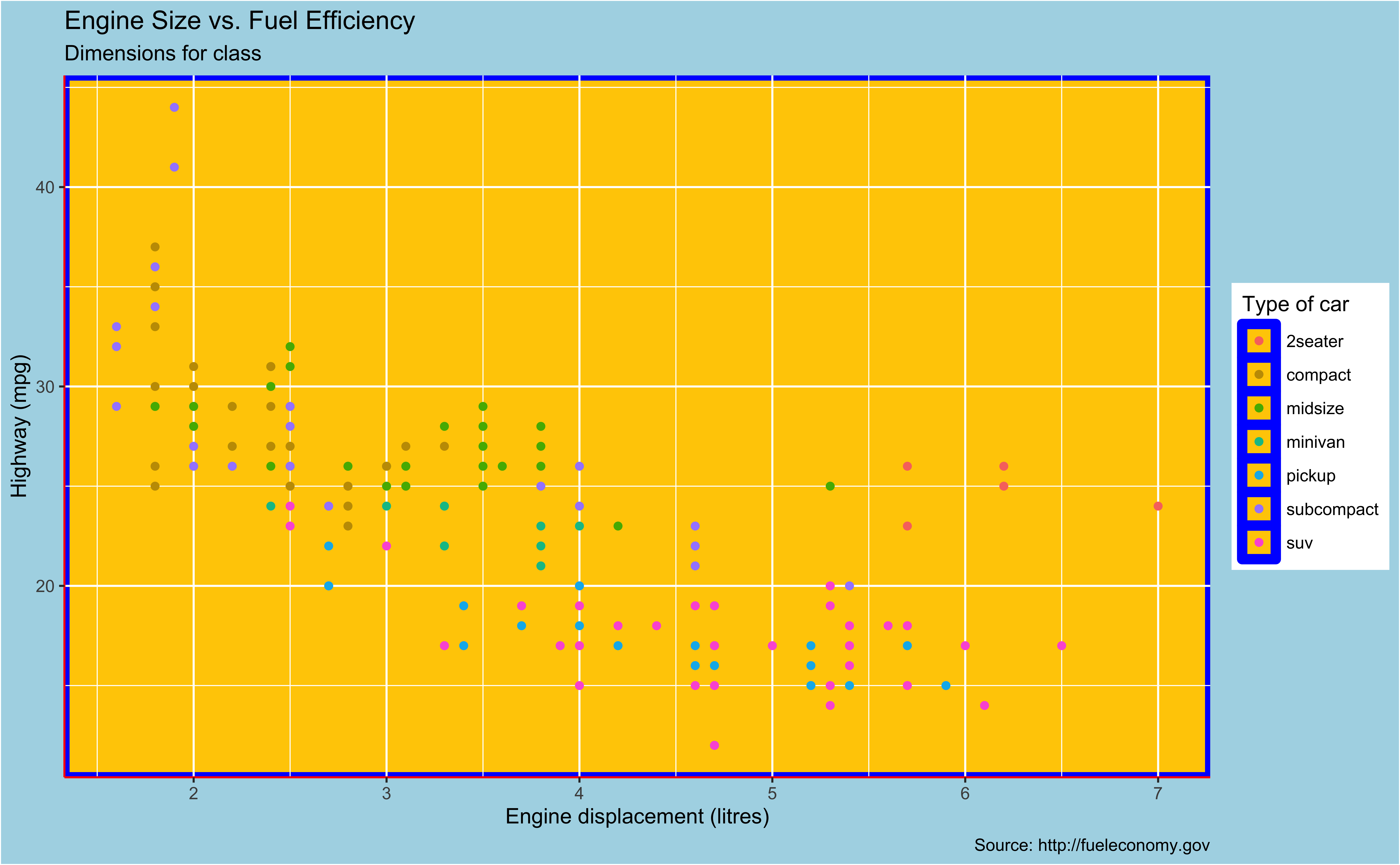
In conjunction with the theme system, the element_ functions specify the display of how non-data components of the plot are drawn.
element_blank(): draws nothing, and assigns no space.
element_rect(): borders and backgrounds.
element_line(): lines.
element_text(): text.
panel.background: background of plotting area plot.background: background of the entire plot
Aesthetics
- OK. Let’s talk a little more about aesthetics, so that your plot can be more informative.
Aesthetics options
Commonly used characteristics of plotting characters that can be mapped to a specific variable in the data are
colourshapesize-
alpha(transparency)
- Remember that we map color to type of car in the scatter plot of hwy mpg and displacement.
- other options can be mapped to a specific variable in the data as well, such as shape, size and alpha that controls the transparency of your geometric objects.
Colour
ggplot(
  data = mpg,
  mapping = aes(
    x = displ,
    y = hwy,
    color = class)) + #<<
  geom_point()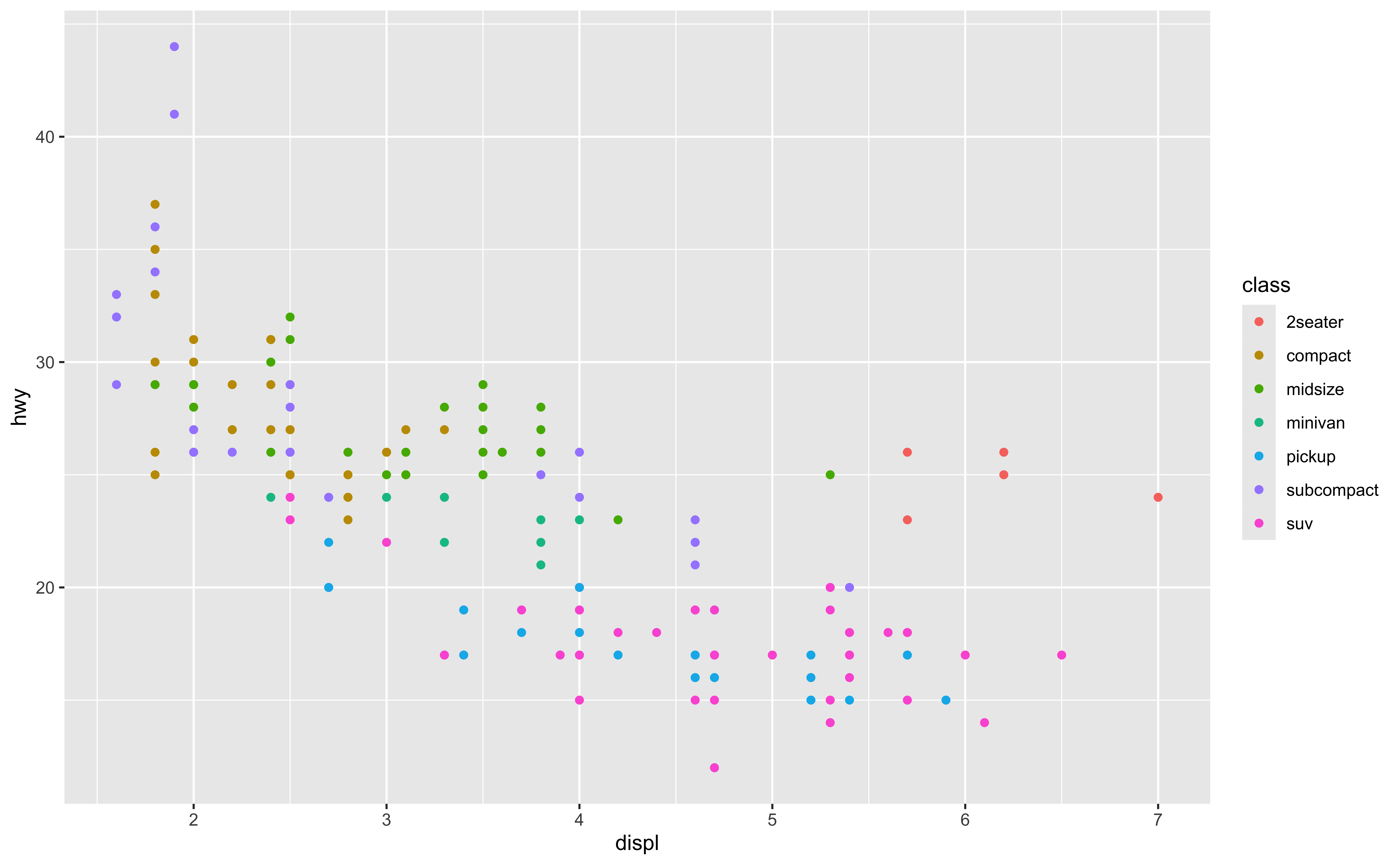
Yes, we have seen this.
Shape
Mapped to a different variable than colour
ggplot(
  data = mpg,
  mapping = aes(
    x = displ,
    y = hwy,
    color = class,
    shape = drv)) + #<<
  geom_point()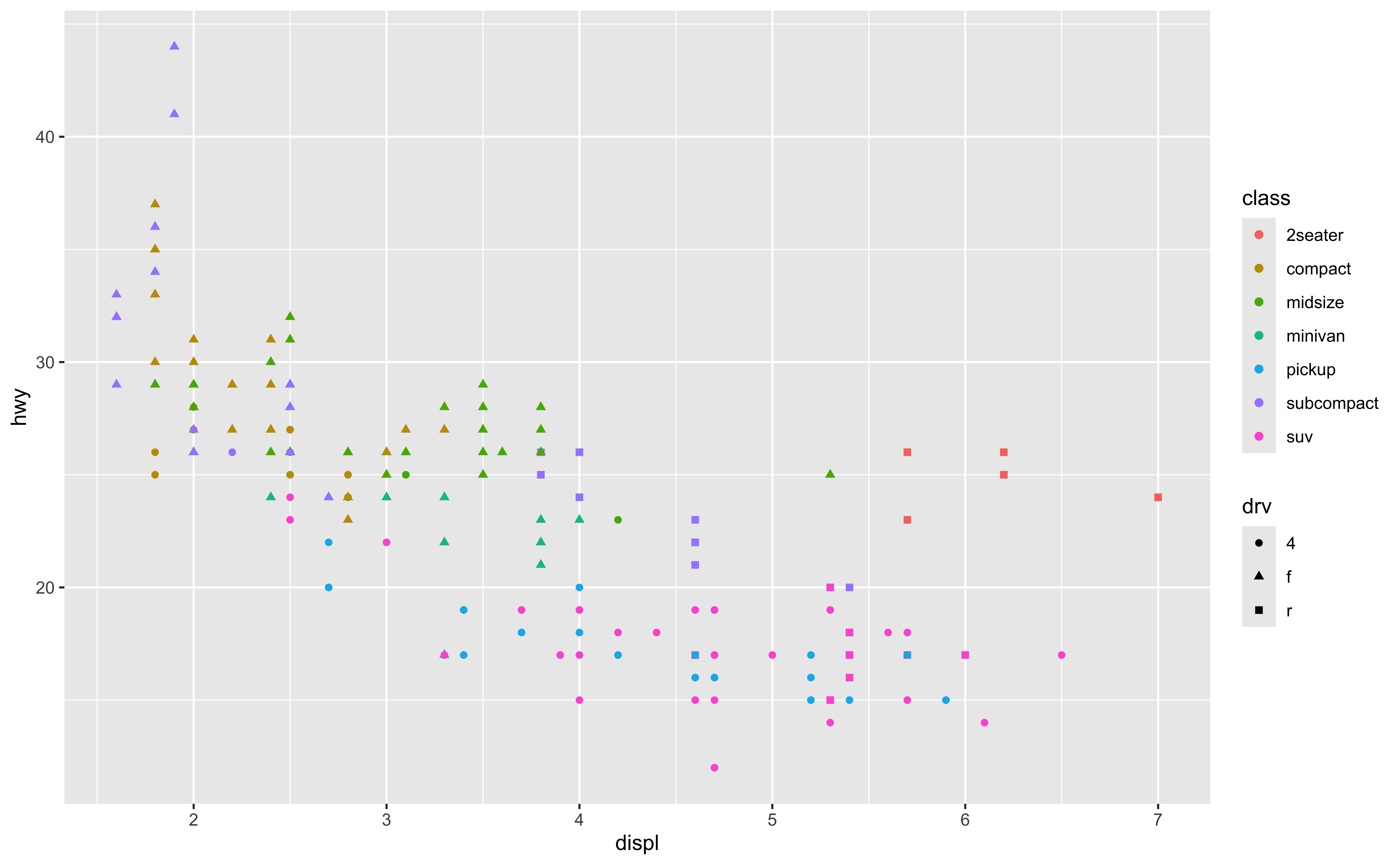
- We can map color to type of car, the class variable, and map point shape to another variable, here the drive type.
- This way, we have more information in one figure. For a single point or an observation, we can learn its displacement and highway mpg values, and we can also learn its class, the car type by color and drive train type by point shape.
Shape
Mapped to same variable as colour
ggplot(
  data = mpg,
  mapping = aes(
    x = displ,
    y = hwy,
    color = class,
    shape = class)) + #<<
  geom_point()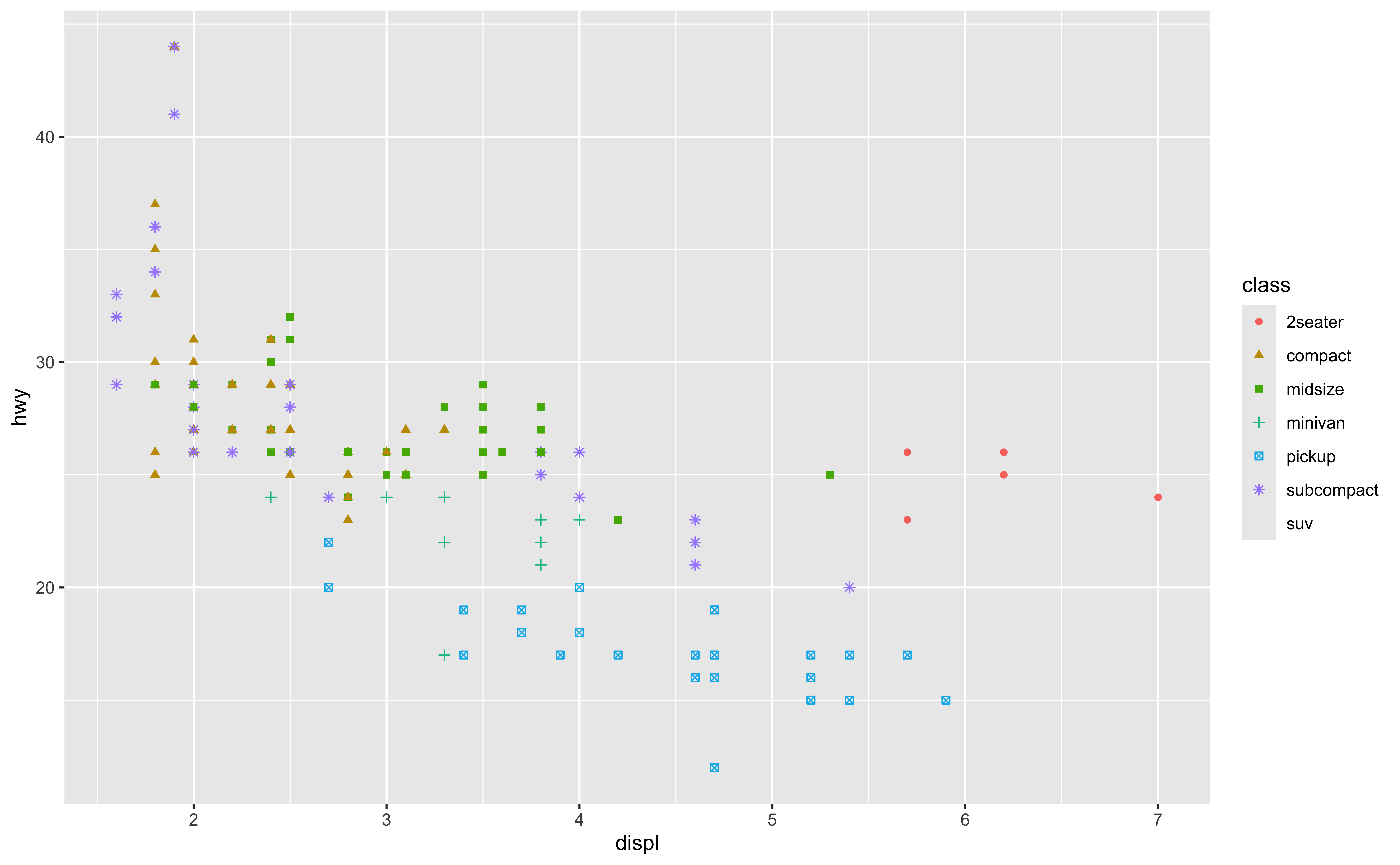
- We can of course map color and shape to the same variable.
- Here, we use both color and point shape to classify or categorize the type of car.
- But you guys need to think if it is meaningful and helpful, or it is just redundant, and make it hard to read the plot.
Size
ggplot(
  data = mpg,
  mapping = aes(
    x = displ,
    y = hwy,
    color = class,
    shape = class,
    size = cty)) + #<<
  geom_point()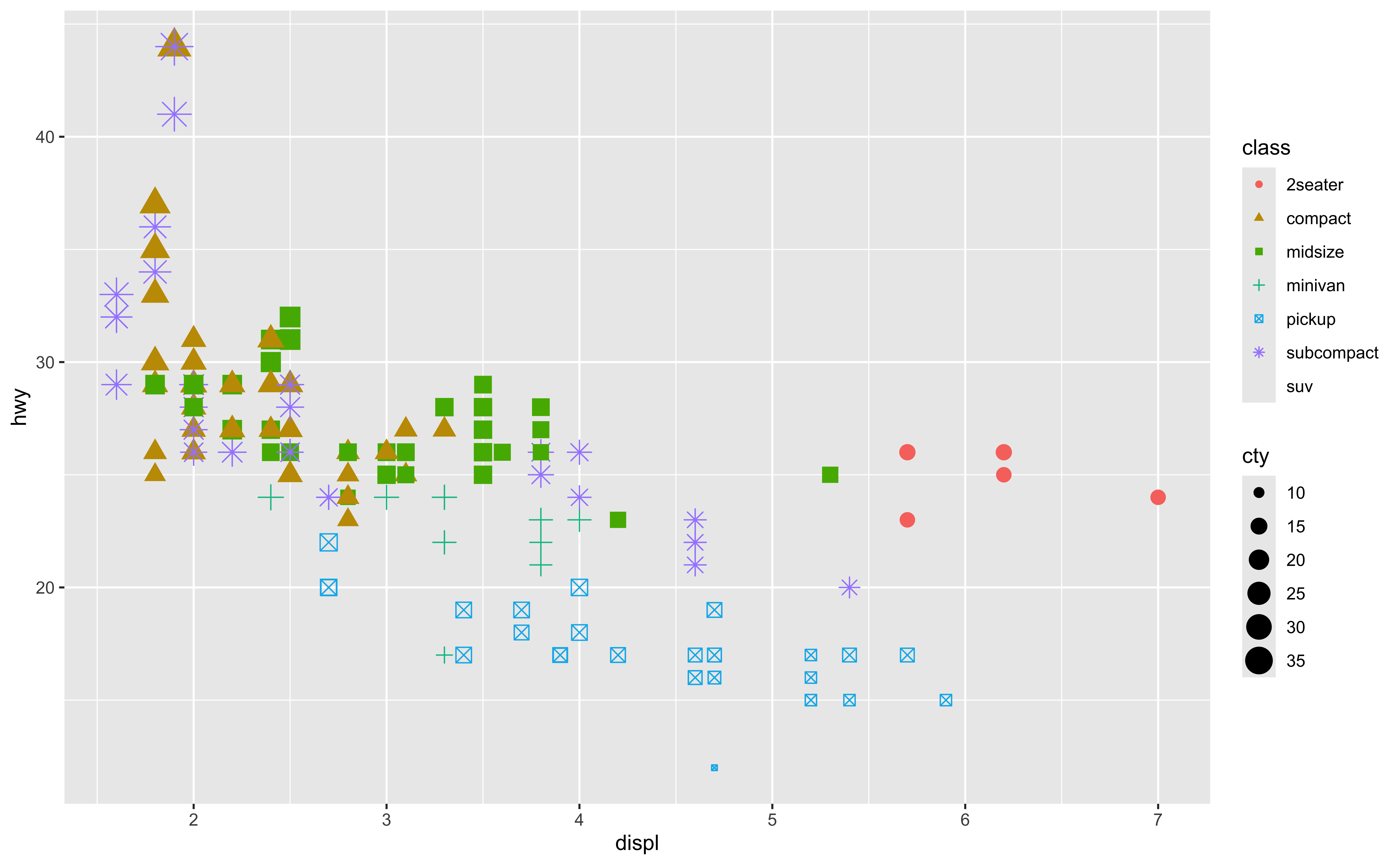
- OK, Size. Here, we use color and shape to indicate car type, and we use point size to represent city mpg. The higher city mpg, the bigger the point is.
- You can see that the plot is not very clear and visible. So it is not always good to include much information in one single plot.
- Yes, the plot contains lots of information, but we may not be able to read those information.
Alpha
ggplot(
  data = mpg,
  mapping = aes(
    x = displ,
    y = hwy,
    color = class,
    shape = class,
    size = cty,
    alpha = year)) + #<<
  geom_point()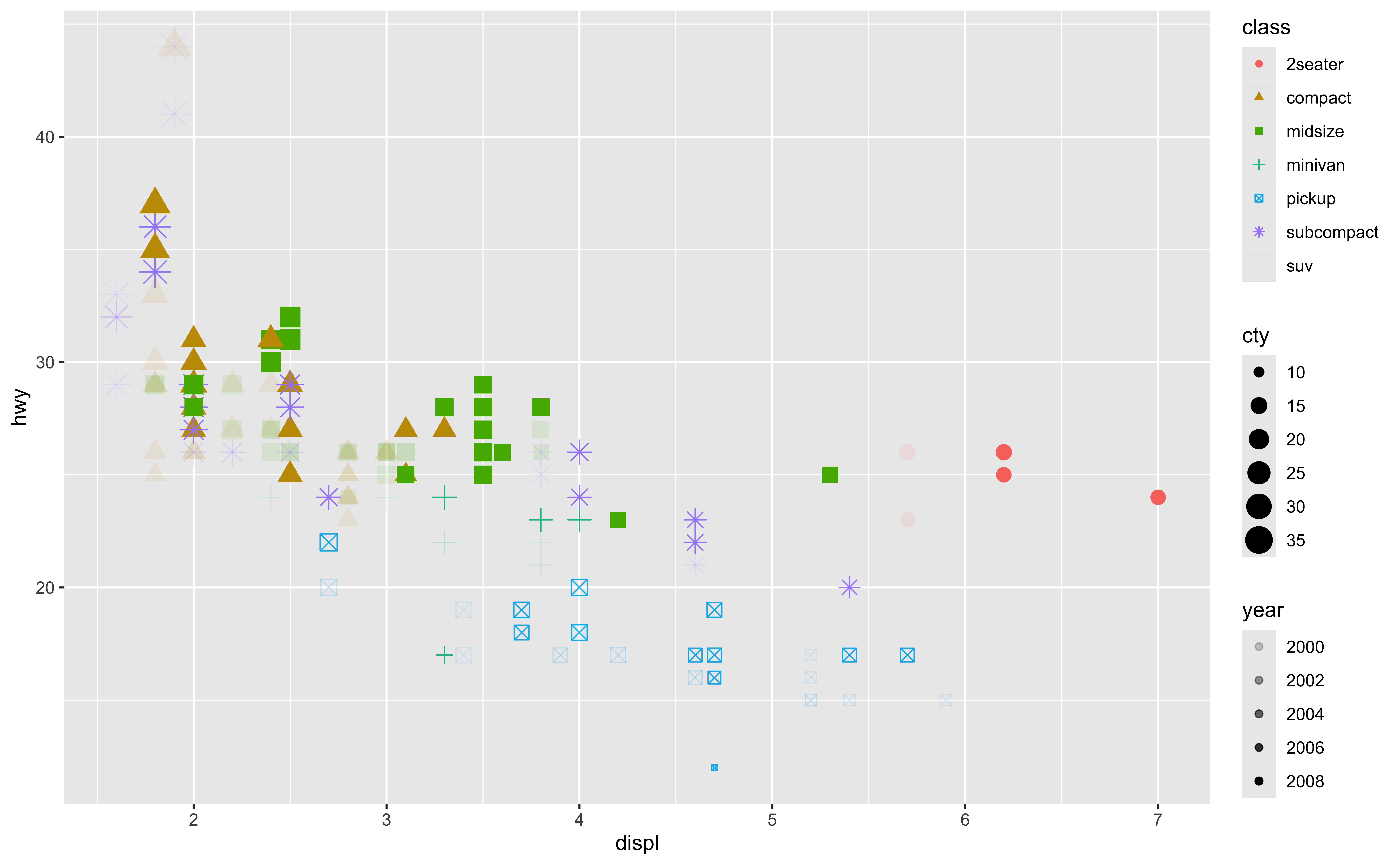
- Here we further map the transparency of points, alpha to the variable year. So the older the car is, the more transparent the point is.
- We use lots of aesthetics options at the same time in one figure. Again, in practice this may not be a good idea, and the plot may not visualize the data well.
- If you are interested in data visualization, there are lots of studies out there talking about what makes a good plot. My suggestion is, don’t put too much information in one single plot. This will make it hard to read.
Mapping vs. Setting
Mapping
- Determine the size, alpha, etc.
based on the values of a variable in the data.
- Goes into
aes().
ggplot(data = mpg,
       mapping = aes(x = displ, y = hwy,
                     size = cty, alpha = year)) + #<<
    geom_point()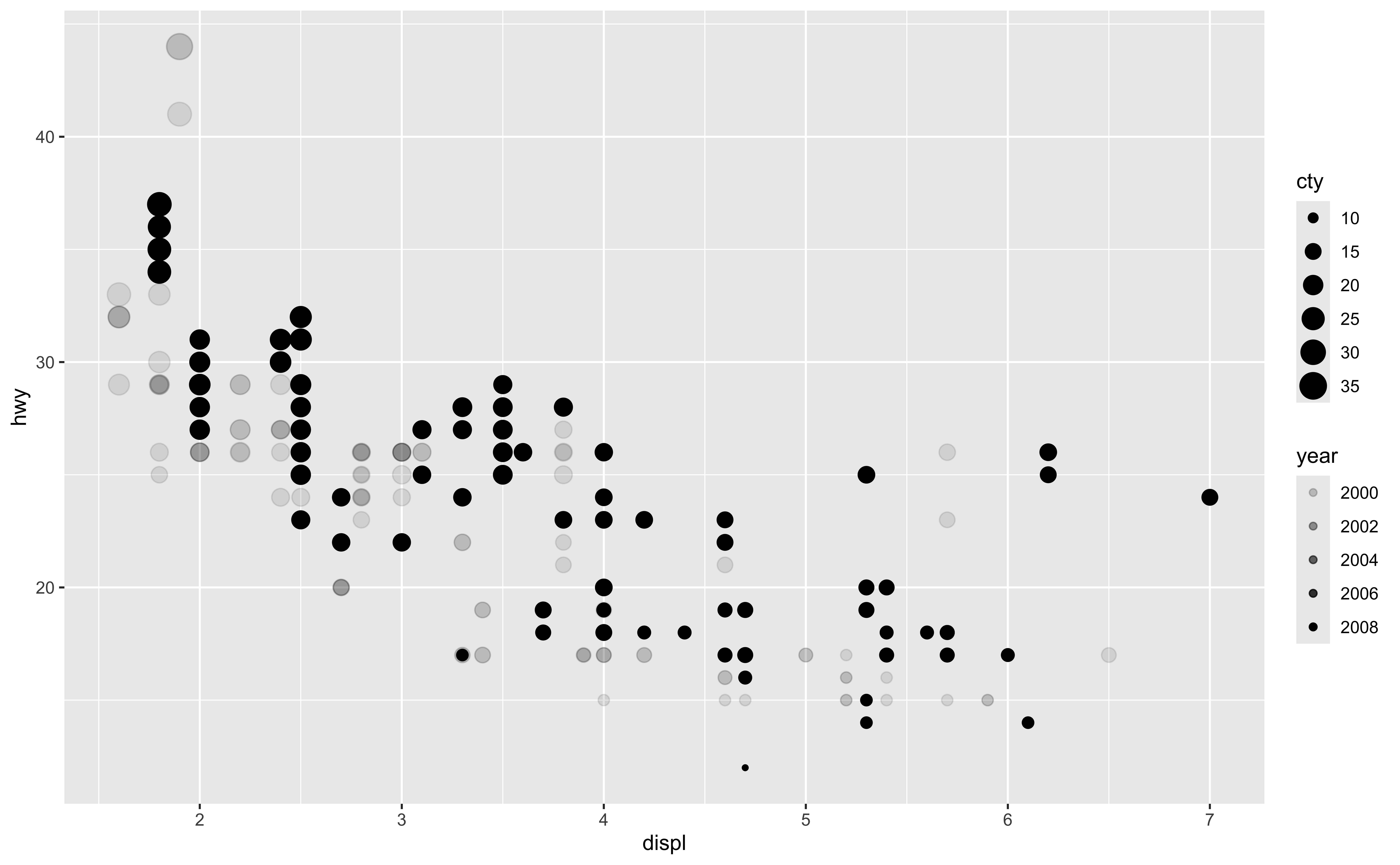
- OK. Now I want to talk about the difference between mapping and setting.
- First, the aesthetic options such as color, size, shape, alpha can be used in both mapping and setting.
- When we use these options in mapping arguments, wrapped by aes() function, we actually map these options to some variables. In other words, we use those options to represents the values of the variables. Like here, the point size is used to represent the city mpg, the different point transparency are for different car years.
- So there is a mapping between aesthetics options and variables.
- Alright setting. When we use the aesthetics options as a geometry setting, the aesthetics are pure decoration of your plot, the aesthetics are not used to represent any other variable values.
- Look at the example here. If we want to set point size at 5 and point transparency at 0.5, we put size = 5, alpha = 0.5 in the geometry function geom_point(), not in the mapping argument.
- And the result is that, all the points in the scatter plot will have size 5 and alpha 0.5. And it is true for all observations and variables. It is not related to any other variables as mapping does. OK.
Mapping vs. Setting
Setting
- Determine the size, alpha, etc.
not based on the values of a variable in the data.
- goes into
geom_*().
ggplot(data = mpg,
       mapping = aes(x = displ, y = hwy)) +
    geom_point(size = 5, alpha = 0.5) #<<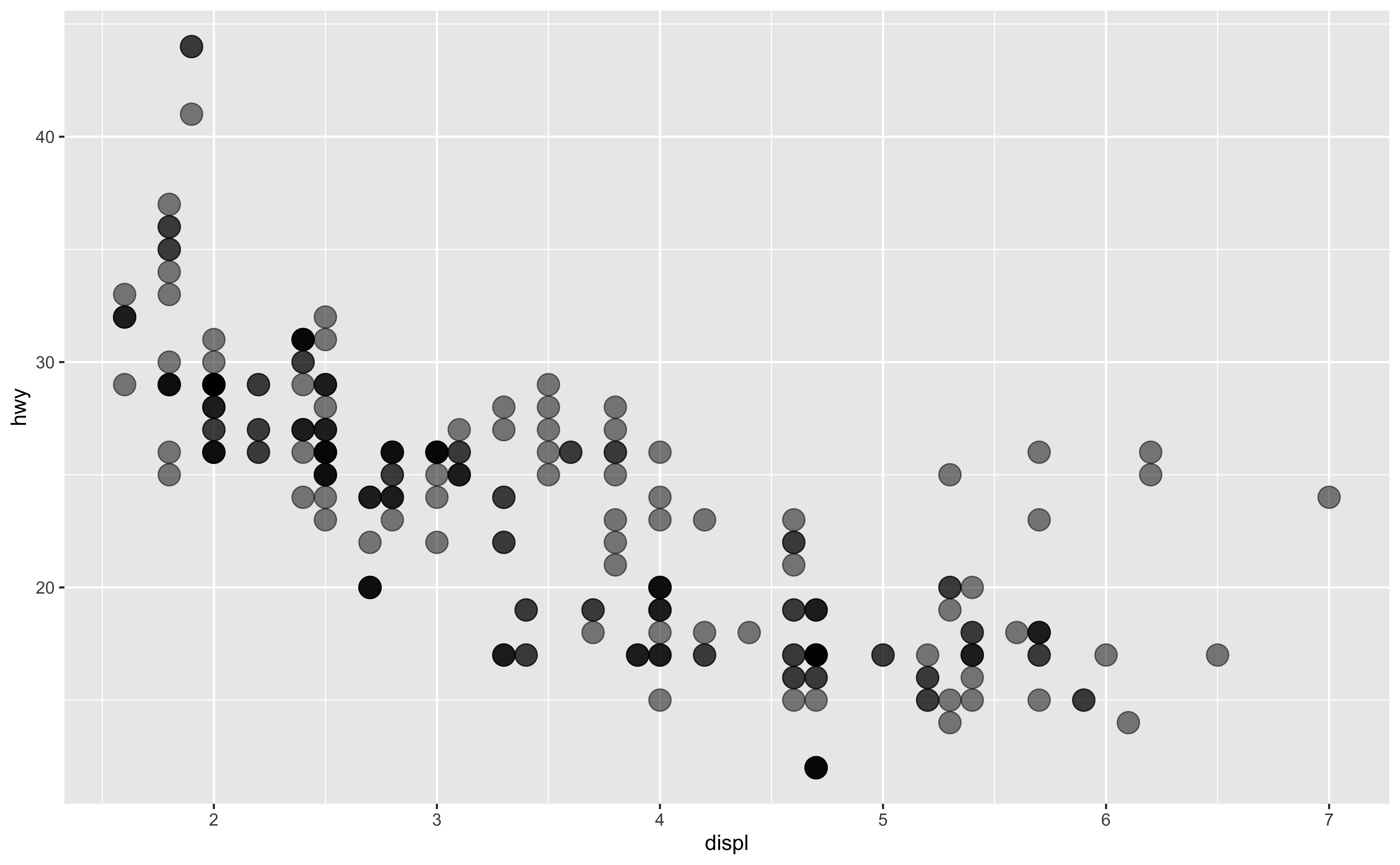
- So here is the summary.
- (
geom_point()in the example, but we’ll learn other geoms soon!)
Faceting
- OK. The last thing I wanna talk about is facet.
Faceting
One way to add additional variables’ information is with aesthetics. But we see that putting all information in one plot may not be a good idea.
Another way, particularly useful for categorical variables, is to
split your plot into facets, smaller plots that each display one subset of the data.
- Useful for exploring conditional relationships and large data.
- You see that one way to add additional variables’ information is with aesthetics mapping. But we see that putting all information in one plot may not be a good idea.
- We can actually present our data using another way, particularly useful for categorical variables, which is split your plot into the so-called facets, so each smaller plot display one subset of the data conditional on some categorical variable.
- The idea is, we can map color to gender in a one single plot, or we can create two small plots, one for male, and the other for female. OK.
ggplot(data = mpg, mapping = aes(x = displ, y = hwy)) +
    geom_point() +
    facet_wrap(~ cyl)  #<<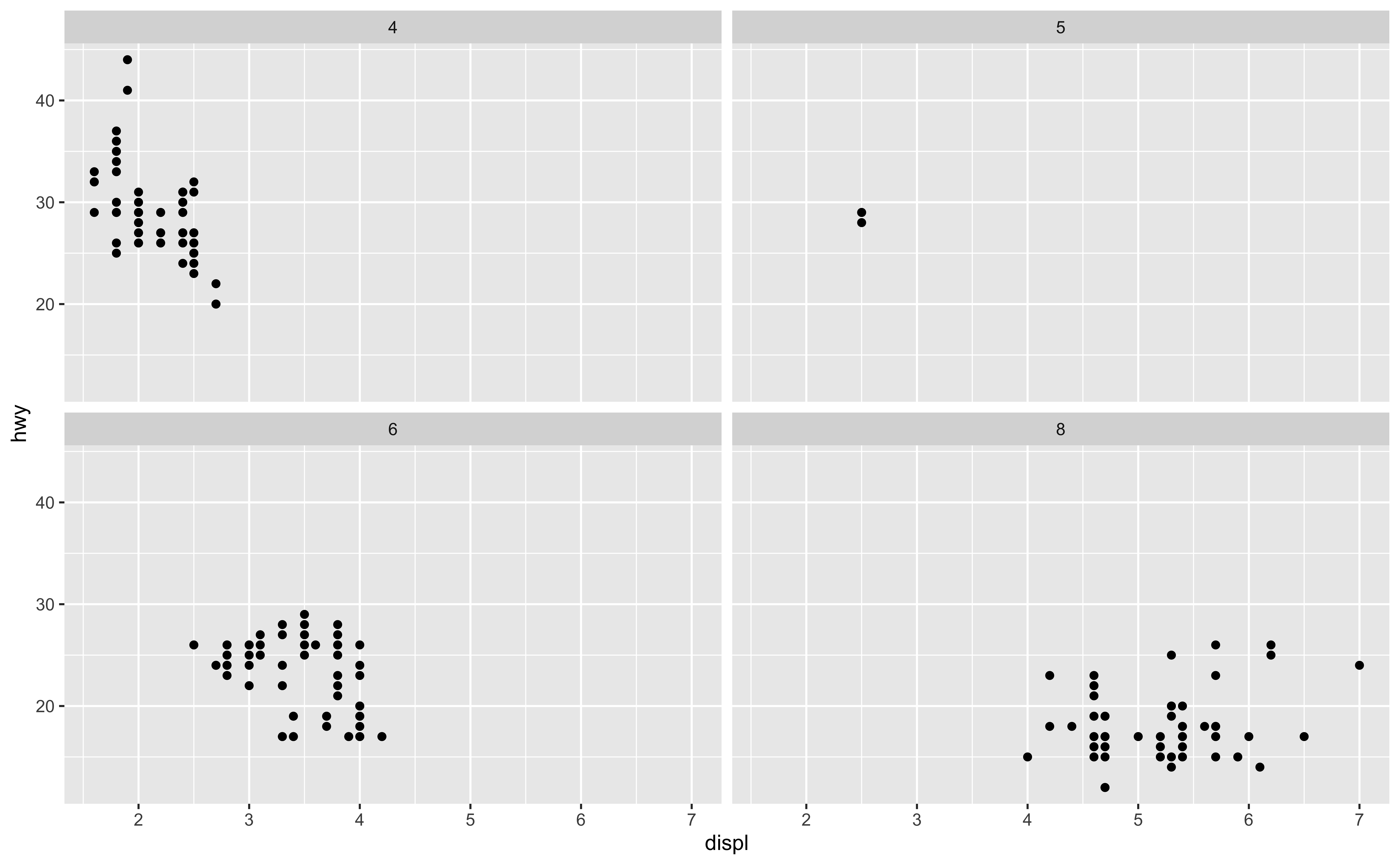
- How about we want to create a scatter plot conditional on just one variable, say cylinder?
- Instead of facet_grid(), we can use facet_wrap() function.
- Inside the parenthesis, we use ~ followed by the variable name cyl.
- And the ggplot will automatically create a display, so that each smaller plot is normally rectangular.
ggplot(data = mpg, mapping = aes(x = displ, y = hwy)) +
    geom_point() +
    facet_wrap("cyl")  #<<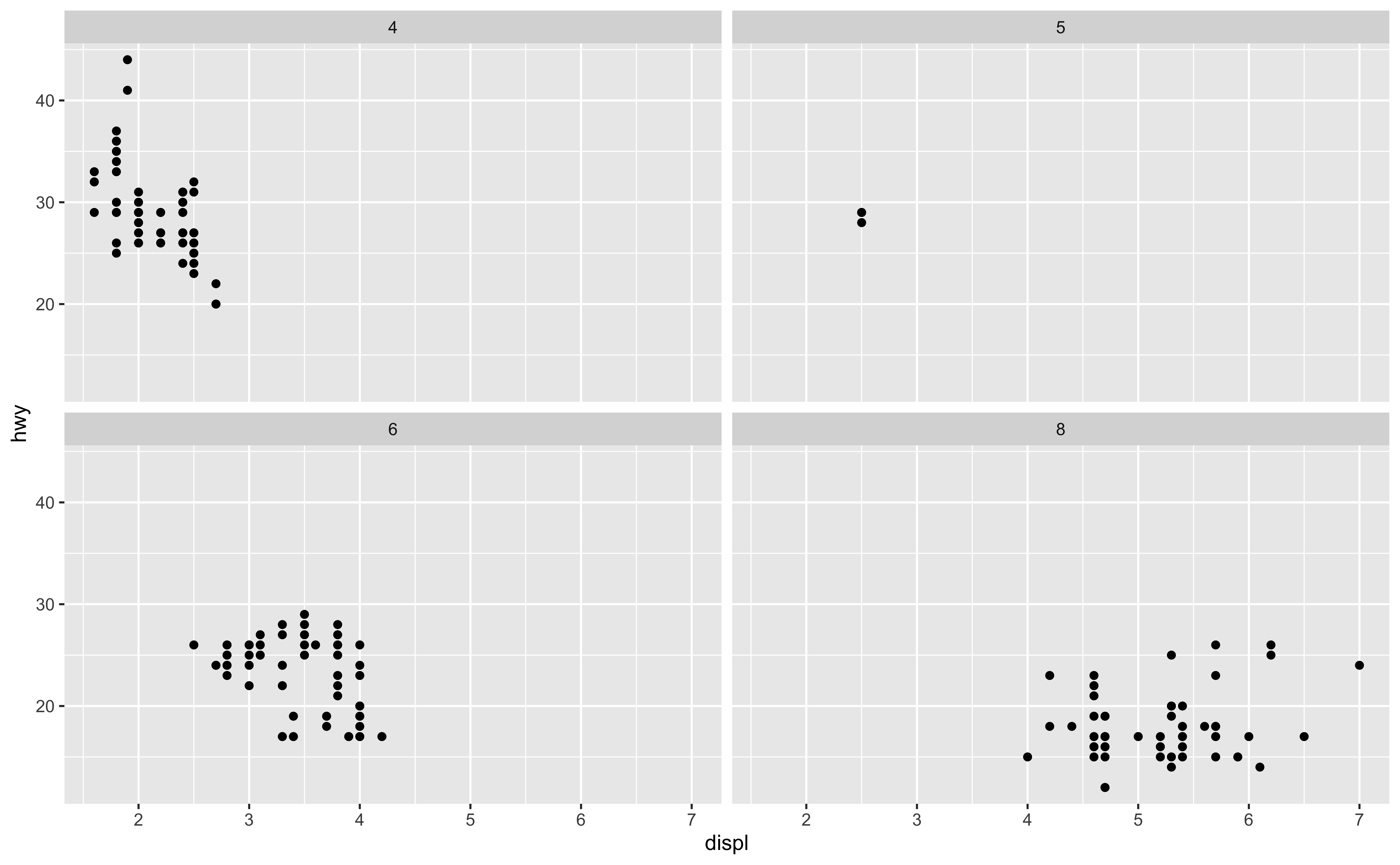
- If you don’t like vars(), you can use ““. It gives you the same plot as well. OK
ggplot(data = mpg, mapping = aes(x = displ, y = hwy)) +
    geom_point() +
    facet_wrap(~ cyl, ncol = 2) #<<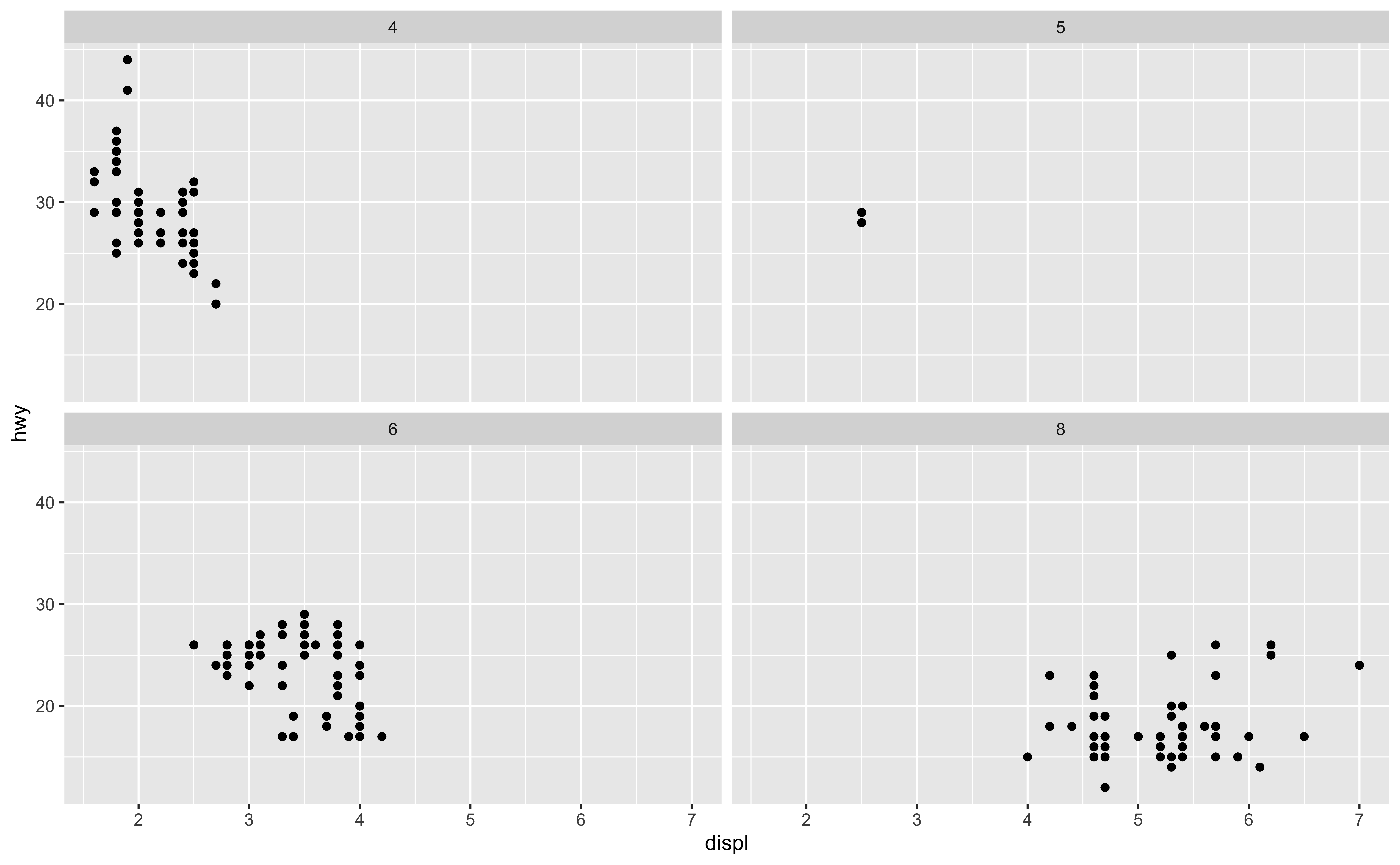
- How about we want to create a scatter plot conditional on just one variable, say cylinder?
- Instead of facet_grid(), we can use facet_wrap() function.
- Inside the parenthesis, we use ~ followed by the variable name cyl.
- And the ggplot will automatically create a display, so that each smaller plot is normally rectangular.
- If you don’t like the default display, you can specify any number of rows or columns you like.
- For example, here the number of column is 3.
ggplot(data = mpg, mapping = aes(x = displ, y = hwy)) +
    geom_point() +
    facet_grid(drv ~ cyl)  #<<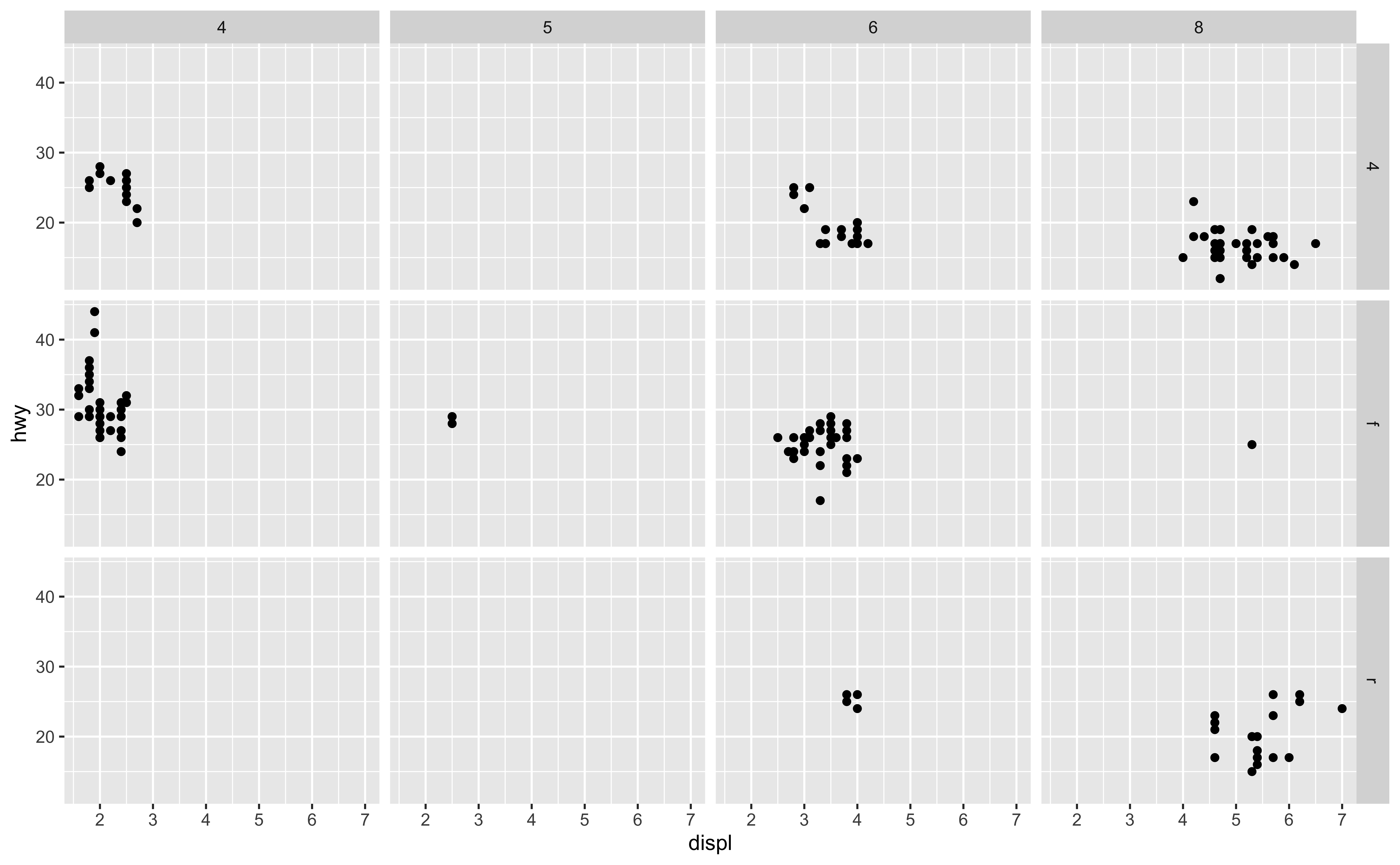
- Suppose again we would like to see the relationship between hwy and displacement.
- But now we want to see their relationship given at a different number of cylinders and type of drive trains.
- And we can create several scatterplots, each at a particular number of cylinders and type of drive trains.
- How do we create facets?
- We can use facet_grid() command to create a matrix-like plot defined by row and column faceting variables, which are usually categorical variables. Inside the parenthesis, we put the row variable ~ column variable.
- So here, drive values, 4, f, r defines the rows, and cylinder values 4, 5, 6, 8 defines the columns.
- And each smaller plot is a scatter plot with some value of drive and some value of cylinder.
- For example, the top right one is the scatter plot of hwy mpg and displacement when drive is 4 and cylinder is 8.
Faceting Summary
-
facet_grid():- 2d grid
rows ~ cols
-
facet_wrap(): 1d ribbon wrapped according to number of rows and columns specified or available plotting area
-
facet_grid():- 2d grid
rows ~ cols- use
.for no split (no rows or no cols)
-
facet_wrap(): 1d ribbon wrapped according to number of rows and columns specified or available plotting area
Facet and Color
ggplot(data = mpg, mapping = aes(x = displ, y = hwy, color = drv)) +
    geom_point() +
    facet_grid(drv ~ cyl)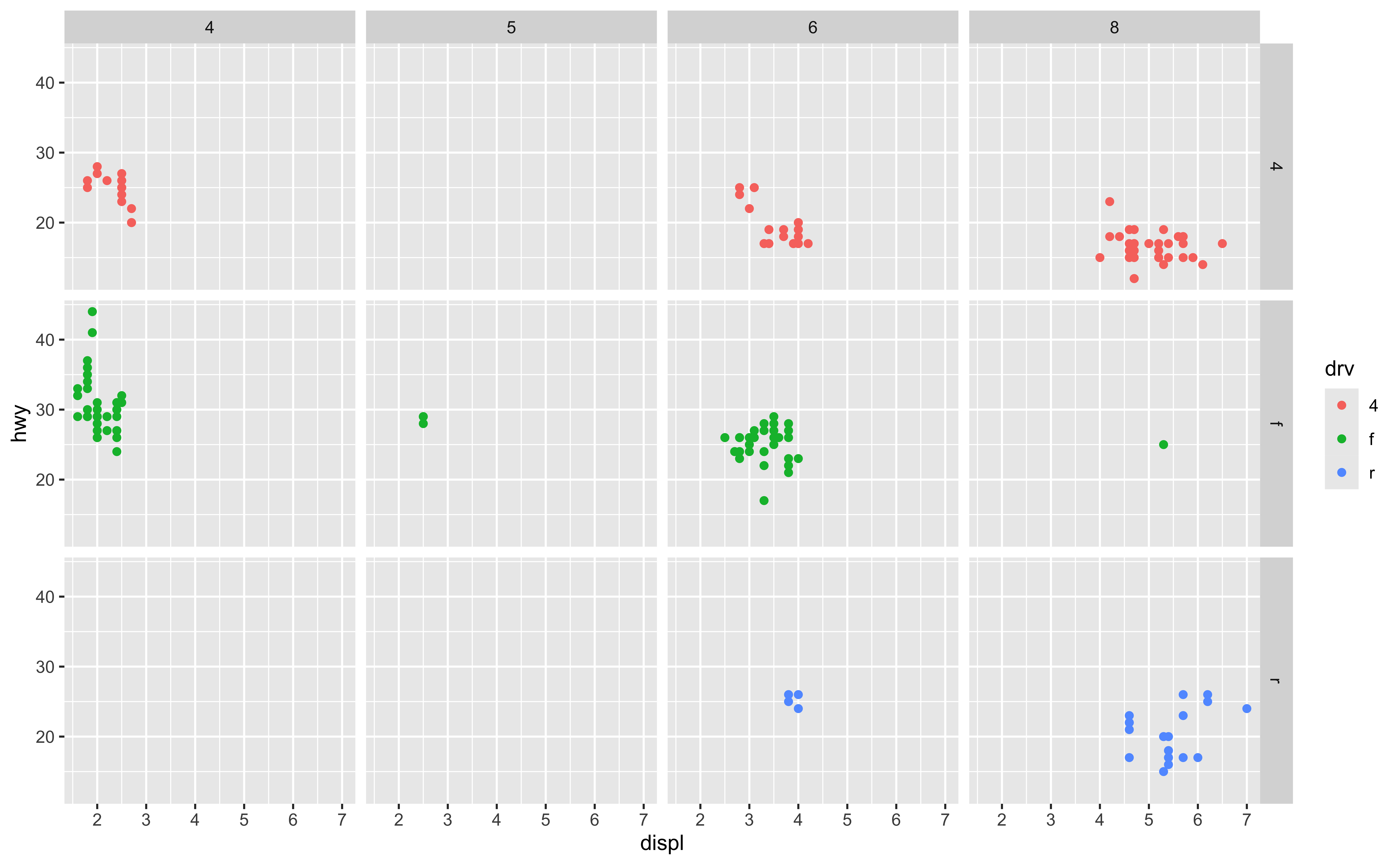
- We can add color to faceting variables for sure.
- For example here, we map color to variable drive, which is the row variable in faceting.
- And now each row has its own color.
Facet and Color with no Legend
ggplot(data = mpg, mapping = aes(x = displ, y = hwy, color = drv)) +
    geom_point() +
    facet_grid(drv ~ cyl) +
    guides(color = "none") #<<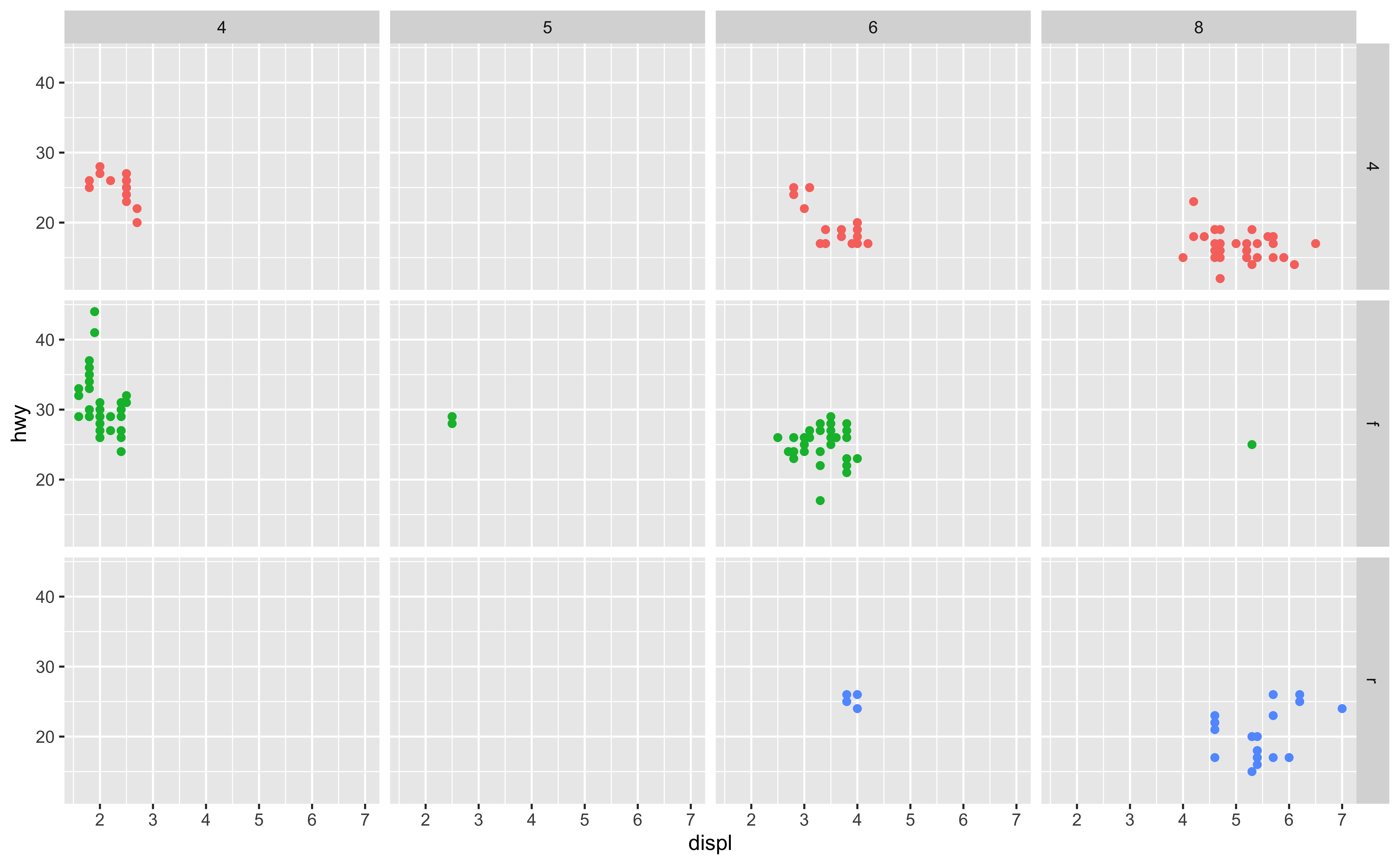
theme(legend.position = “none”) - Since each row is for one value of drive, it’s pretty clear to see which color is for which value of drive. - If you don’t want the legend, use guides() and set color = FALSE. - Basically guides() can set or remove the legend for a specific aesthetic option. If you have two aesthetics color and size, guides(color = FALSE) will only remove the legend for color and the legend for size will be still there. OK.
12-Faceting
In lab.qmd ## Lab 12 section,
ggplot(data = _______, mapping = aes(x = ______, y = ______)) +
    geom______(______ = 0.4) +
    facet_grid(______ ~ _______)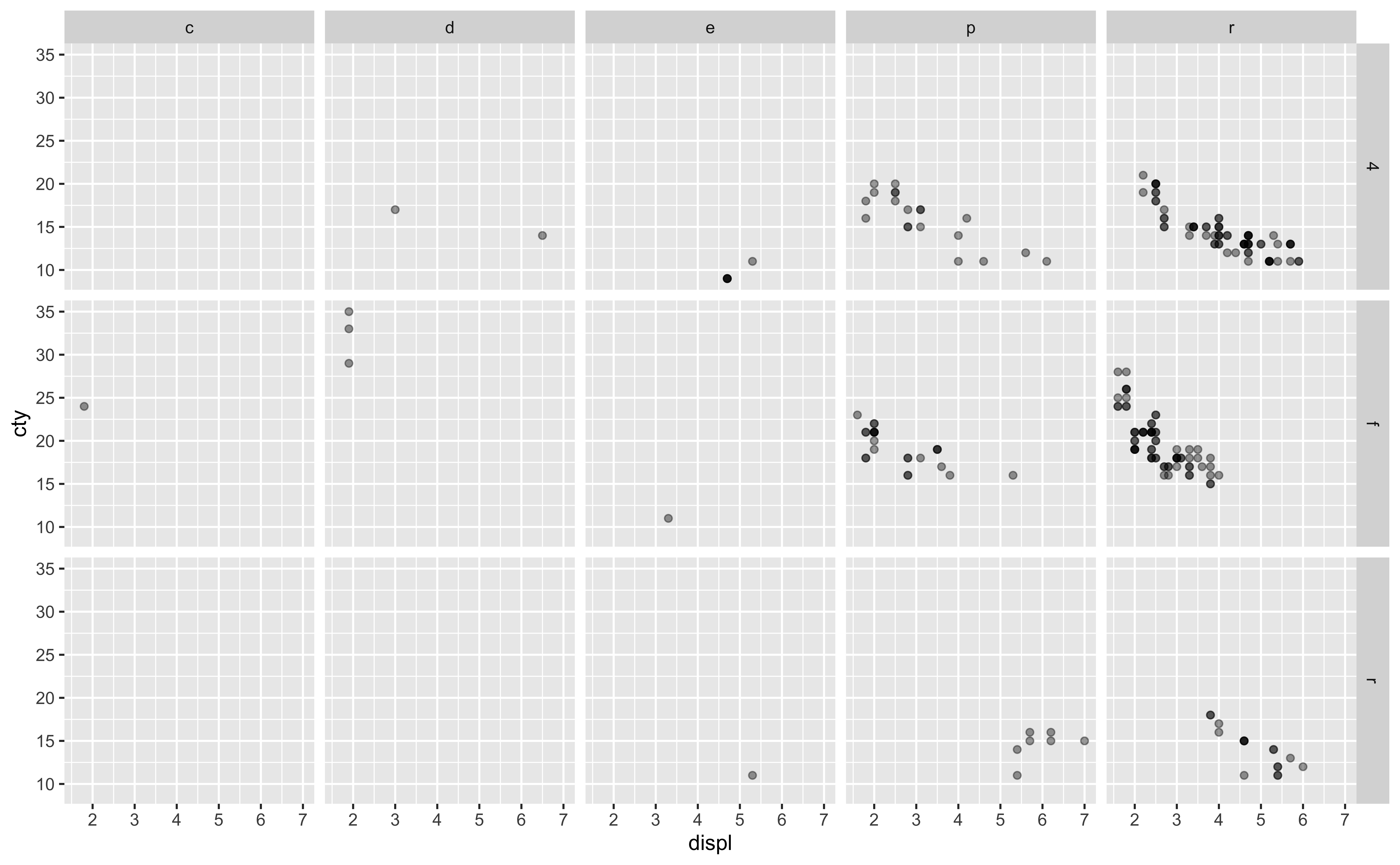
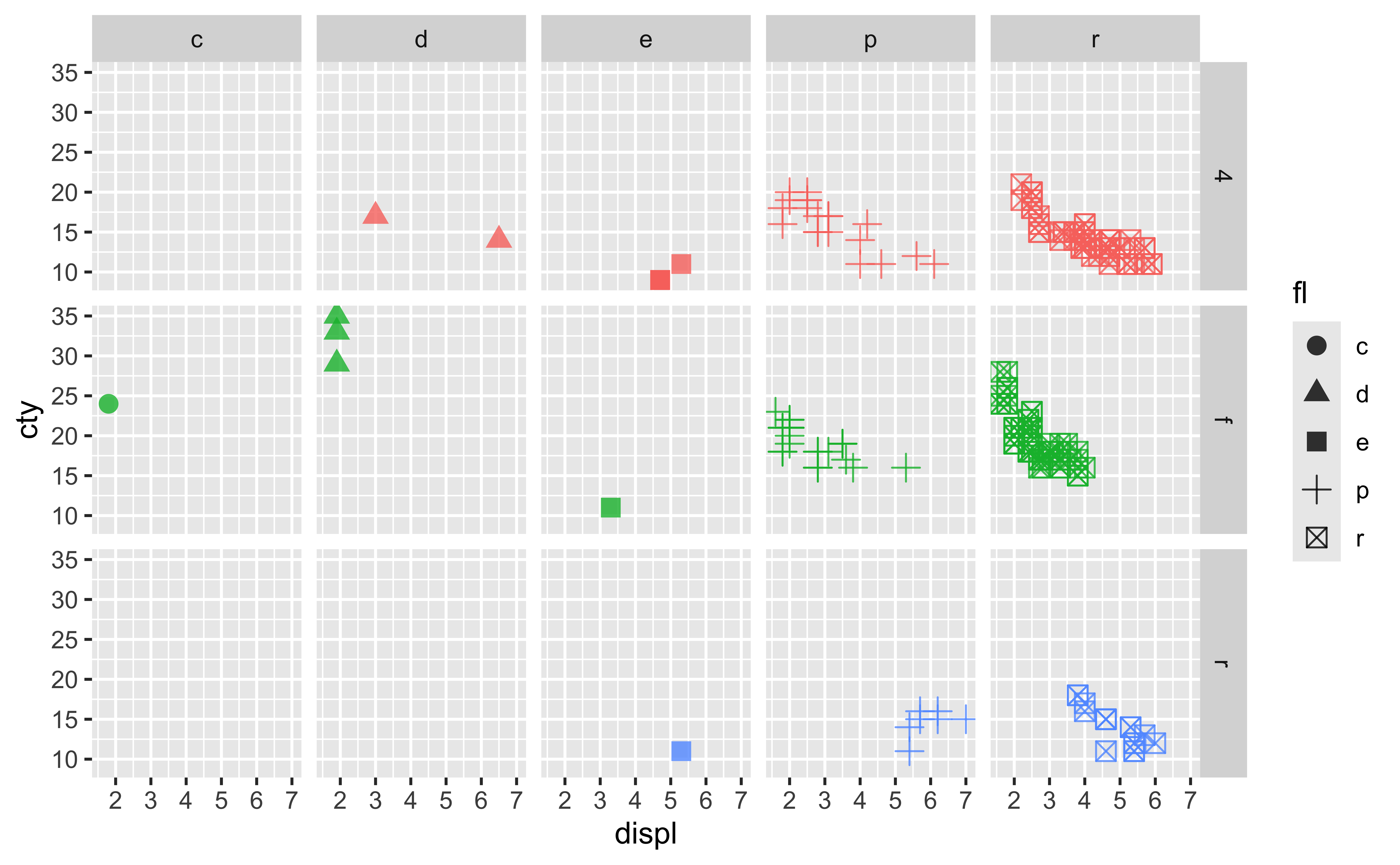
ggplot(data = mpg, mapping = aes(x = displ, y = cty, color = drv, shape = fl)) + geom_point(size = 3, alpha = 0.8) + facet_grid(drv ~ fl) + guides(color = “none”)
12-Faceting
>How do I generate the attached plot usingggplot2and the data setmpg? Explain the code.
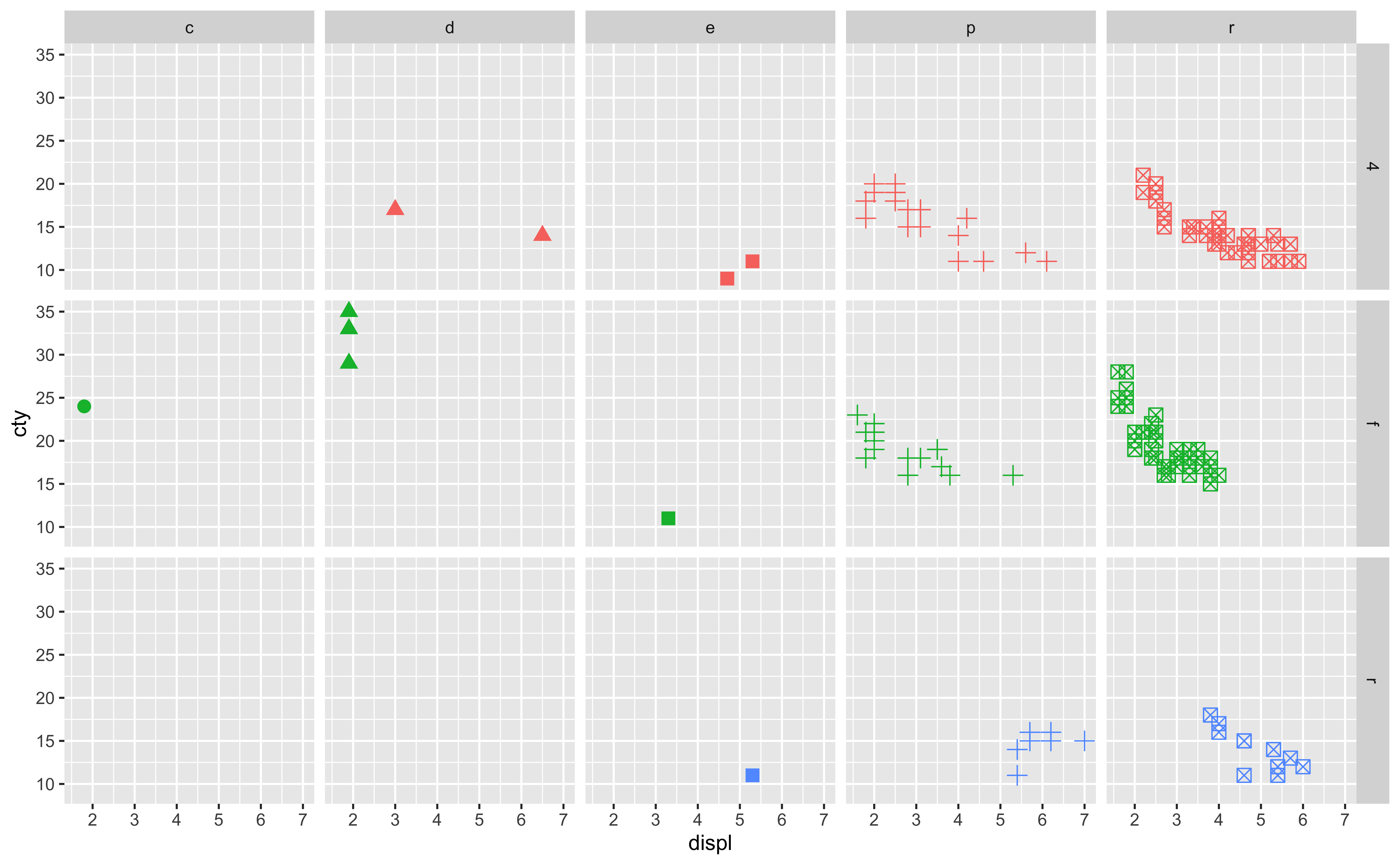
- Share what you learned from AI!~
ggplot for Python
plotnine package
Syntax are the same as ggplot in R.
from plotnine import ggplot, geom_point, aes, stat_smooth, facet_wrap